
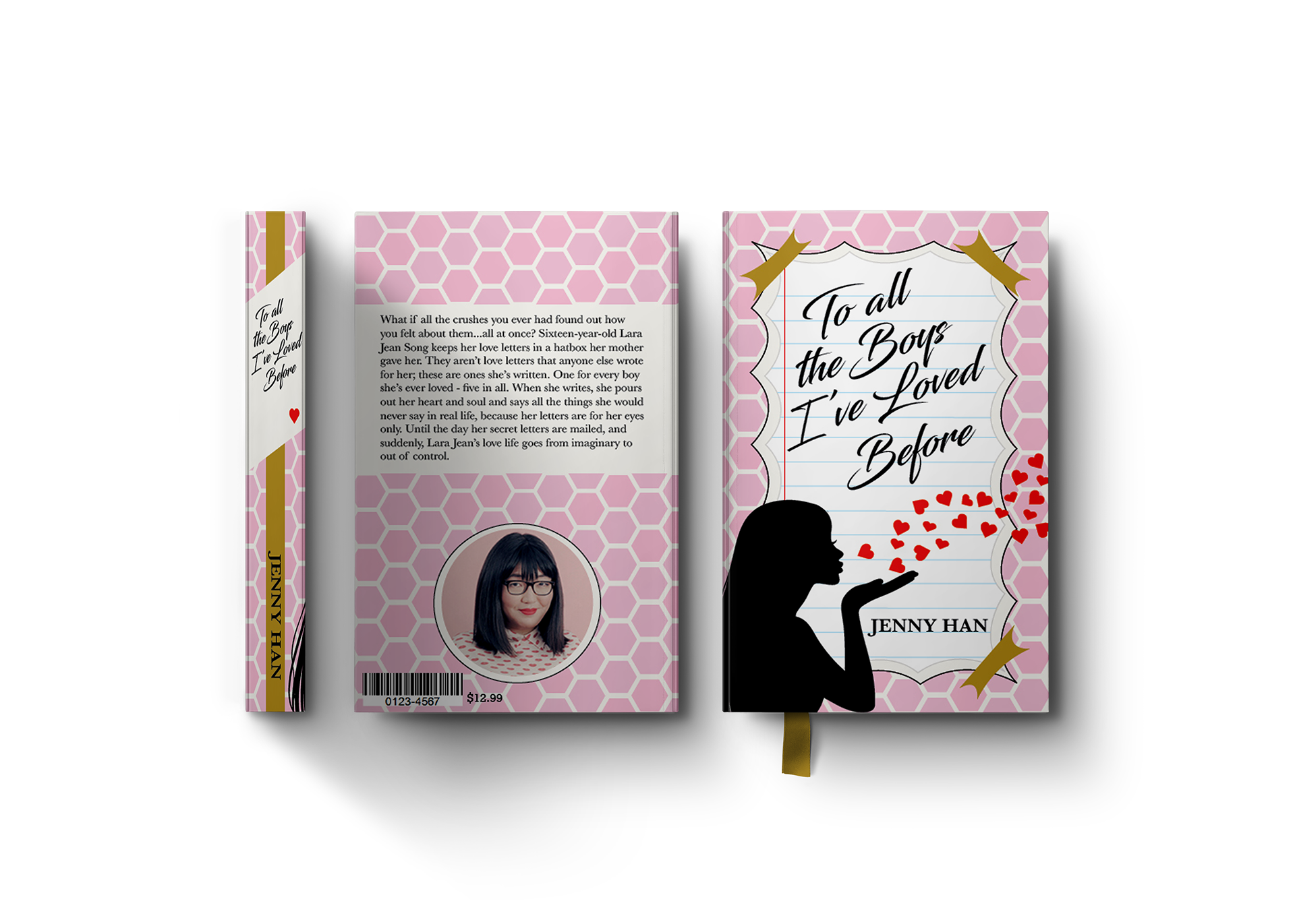
Book Cover 1
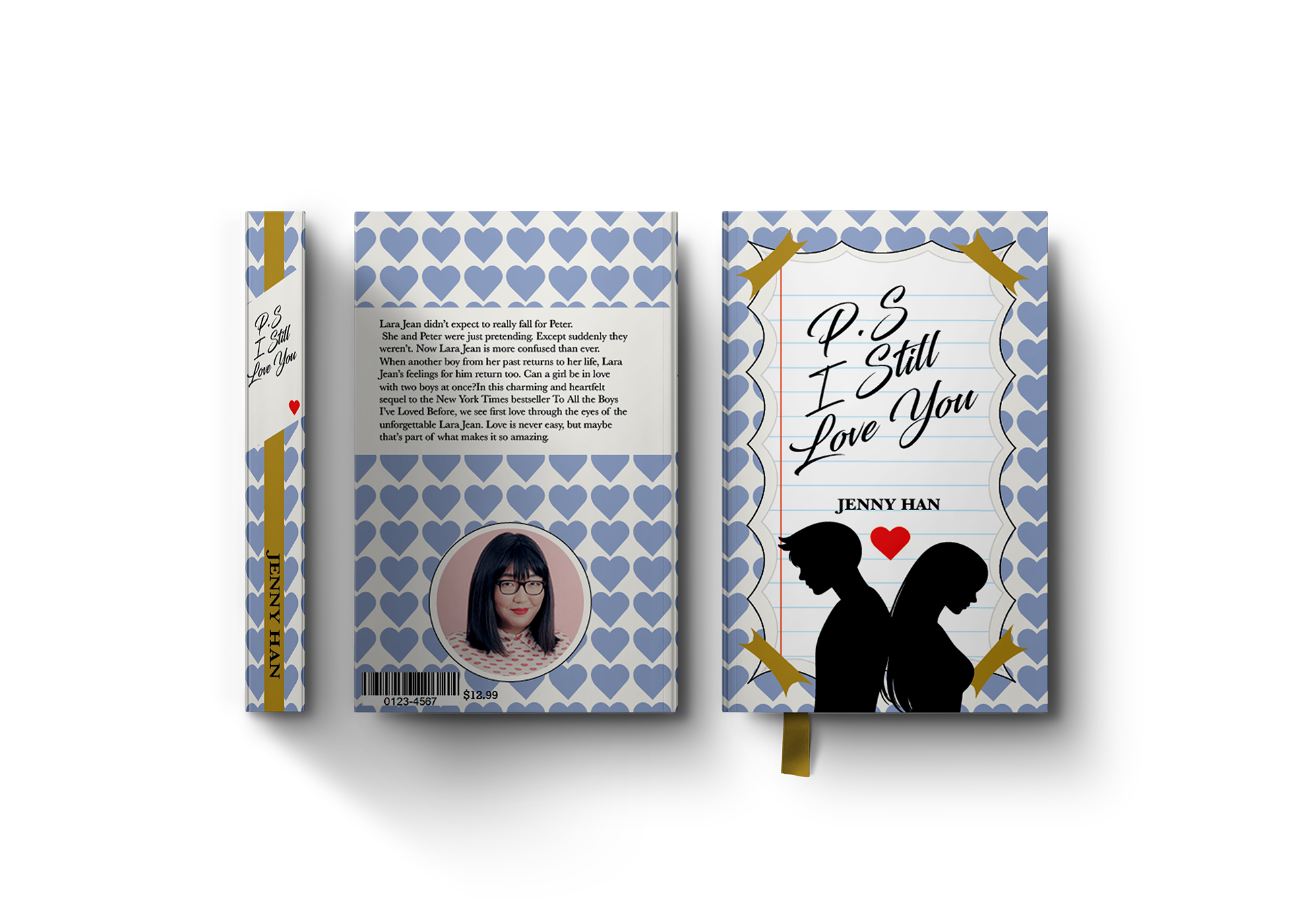
Book Cover 2
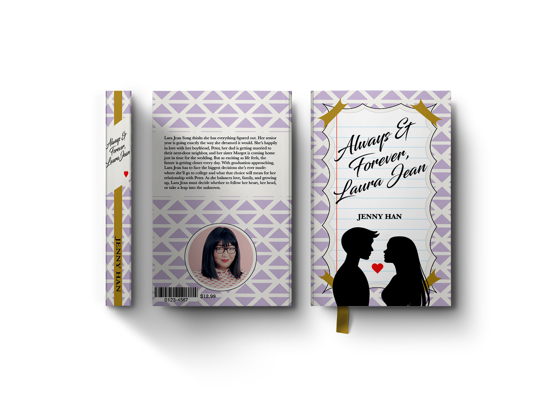
Book Cover 3
Project Overview
This editorial design project focuses on redesigning the book covers for To All the Boys I’ve Loved Before series, creating a cohesive and visually engaging system across all three books. The goal was to develop covers that feel fresh, contemporary, and appealing to a young adult audience while clearly reflecting the story’s central themes of personal letters, romance, and emotional vulnerability. The redesign aims to unify the series visually while giving each book its own distinct identity.
This editorial design project focuses on redesigning the book covers for To All the Boys I’ve Loved Before series, creating a cohesive and visually engaging system across all three books. The goal was to develop covers that feel fresh, contemporary, and appealing to a young adult audience while clearly reflecting the story’s central themes of personal letters, romance, and emotional vulnerability. The redesign aims to unify the series visually while giving each book its own distinct identity.
The Problem
Book series often struggle with maintaining visual consistency across multiple titles while still allowing each installment to stand out individually. In addition, existing covers may not fully connect with modern audiences or clearly communicate the tone of the story. The challenge was to create a system that feels cohesive across all three books, captures the essence of the narrative, and appeals to a contemporary young adult readership.
Book series often struggle with maintaining visual consistency across multiple titles while still allowing each installment to stand out individually. In addition, existing covers may not fully connect with modern audiences or clearly communicate the tone of the story. The challenge was to create a system that feels cohesive across all three books, captures the essence of the narrative, and appeals to a contemporary young adult readership.
Target Audience
The target audience consists primarily of young adult readers, particularly teens and young adults who are drawn to romance, coming-of-age stories, and character-driven narratives. This audience is visually influenced by trends in social media, lifestyle branding, and contemporary illustration, making it important for the covers to feel modern, relatable, and emotionally engaging.
The target audience consists primarily of young adult readers, particularly teens and young adults who are drawn to romance, coming-of-age stories, and character-driven narratives. This audience is visually influenced by trends in social media, lifestyle branding, and contemporary illustration, making it important for the covers to feel modern, relatable, and emotionally engaging.
Concept & Approach
The concept is rooted in the idea of private letters becoming public, a key narrative element in the story. This idea is translated visually through notebook paper textures, handwritten-style typography, and note-inspired layouts that mimic personal, intimate communication.
The concept is rooted in the idea of private letters becoming public, a key narrative element in the story. This idea is translated visually through notebook paper textures, handwritten-style typography, and note-inspired layouts that mimic personal, intimate communication.
The approach emphasizes a balance between softness and structure—combining playful, romantic elements with a clear and consistent layout system. This ensures the covers feel expressive and emotional while still maintaining a strong visual framework.
Visual System & Design Elements
A cohesive visual system is established through repeated structural elements across all three covers. These include centered compositions, script-style typography, and framed paper shapes that act as focal points for the main titles. The handwritten aesthetic reinforces the theme of personal letters, while also adding a sense of authenticity and intimacy.
A cohesive visual system is established through repeated structural elements across all three covers. These include centered compositions, script-style typography, and framed paper shapes that act as focal points for the main titles. The handwritten aesthetic reinforces the theme of personal letters, while also adding a sense of authenticity and intimacy.
Each book incorporates its own unique color palette and pattern system—such as hearts, subtle geometric shapes, or decorative motifs—to differentiate the covers while maintaining overall unity. These variations allow each installment to feel distinct without breaking the visual system.
Silhouetted figures are used to represent characters and relationships. This approach keeps the designs universal and relatable, allowing readers to project themselves into the narrative rather than focusing on specific character depictions. It also maintains a clean, minimal aesthetic that aligns with the overall design direction.
Supporting elements such as hearts, soft color gradients, and layered textures help reinforce the romantic tone of the series. The combination of these elements creates a balance between playful and polished.
Typography & Layout
Typography plays a central role in communicating both theme and tone. Script lettering is used for the titles to evoke the look of handwritten notes, while supporting text remains clean and legible to maintain readability. The hierarchy is carefully structured so that the title remains the focal point, supported by secondary information such as the author’s name.
Typography plays a central role in communicating both theme and tone. Script lettering is used for the titles to evoke the look of handwritten notes, while supporting text remains clean and legible to maintain readability. The hierarchy is carefully structured so that the title remains the focal point, supported by secondary information such as the author’s name.
The layouts are consistent across all covers, using alignment and spacing to create a sense of order. This consistency strengthens the series identity while allowing visual variations to stand out more effectively.
Challenges
One of the main challenges was creating a design system that could unify three separate books without feeling repetitive. Balancing consistency with enough variation to keep each cover visually interesting required careful control of color, pattern, and composition. Another challenge involved capturing the emotional tone of the story—romantic, personal, and slightly nostalgic—without becoming overly literal or cliché.
One of the main challenges was creating a design system that could unify three separate books without feeling repetitive. Balancing consistency with enough variation to keep each cover visually interesting required careful control of color, pattern, and composition. Another challenge involved capturing the emotional tone of the story—romantic, personal, and slightly nostalgic—without becoming overly literal or cliché.
Outcome & Applications
The final result is a cohesive cover series that successfully balances unity and individuality. Each book is clearly part of the same collection while maintaining its own personality through color and pattern variation.
The final result is a cohesive cover series that successfully balances unity and individuality. Each book is clearly part of the same collection while maintaining its own personality through color and pattern variation.
This project demonstrates a strong understanding of editorial and series design, as well as the ability to translate narrative themes into visual form. The covers are well-suited for both print and digital platforms, including bookstore displays, online retail listings, and promotional materials, effectively engaging the target audience and enhancing the overall identity of the series.