
Project Overview
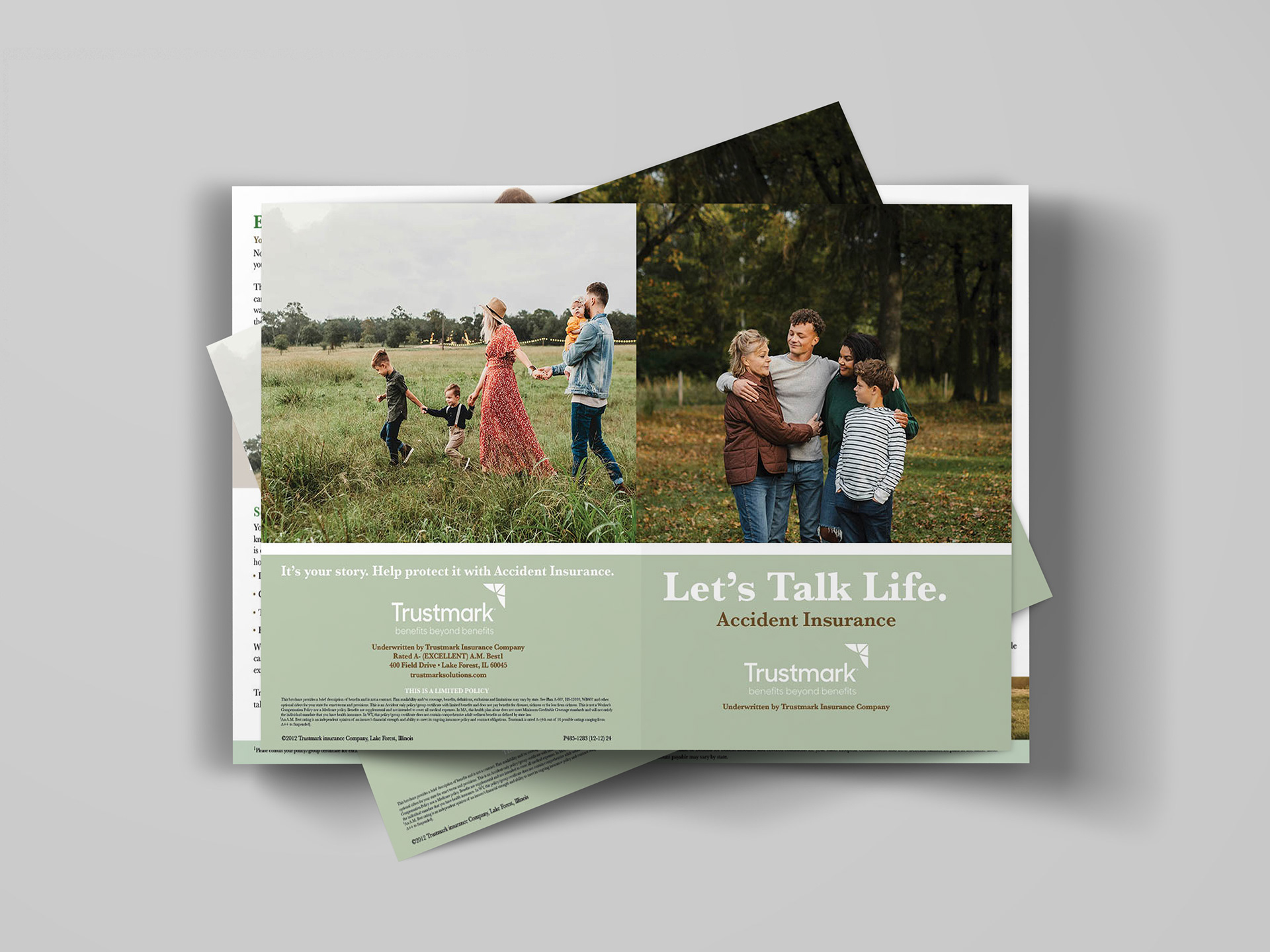
This editorial design project focuses on the creation of a visually cohesive and informative accident insurance booklet for Trustmark. The goal was to design a professional, approachable piece that clearly communicates complex insurance information while maintaining a strong sense of trust, clarity, and visual appeal. The booklet combines structured layouts, thoughtful typography, and lifestyle imagery to guide readers through key information about coverage, benefits, and financial protection.
This editorial design project focuses on the creation of a visually cohesive and informative accident insurance booklet for Trustmark. The goal was to design a professional, approachable piece that clearly communicates complex insurance information while maintaining a strong sense of trust, clarity, and visual appeal. The booklet combines structured layouts, thoughtful typography, and lifestyle imagery to guide readers through key information about coverage, benefits, and financial protection.
The Problem
Insurance materials are often dense, text-heavy, and difficult for readers to engage with or fully understand. This creates a challenge in effectively communicating important information, especially when the content involves technical language and detailed coverage explanations. The task was to transform this complex information into a format that is visually organized, easy to navigate, and accessible to a wide audience, while still maintaining a professional and credible tone.
Insurance materials are often dense, text-heavy, and difficult for readers to engage with or fully understand. This creates a challenge in effectively communicating important information, especially when the content involves technical language and detailed coverage explanations. The task was to transform this complex information into a format that is visually organized, easy to navigate, and accessible to a wide audience, while still maintaining a professional and credible tone.
Target Audience
The target audience includes working adults, families, and individuals exploring accident insurance options. This audience may not have in-depth knowledge of insurance terminology, so the design needed to prioritize clarity, reassurance, and readability. It was also important for the visuals to feel relatable and human-centered, reflecting real-life situations and emotional connections.
The target audience includes working adults, families, and individuals exploring accident insurance options. This audience may not have in-depth knowledge of insurance terminology, so the design needed to prioritize clarity, reassurance, and readability. It was also important for the visuals to feel relatable and human-centered, reflecting real-life situations and emotional connections.
Concept & Approach
The concept centers on “every life has a story,” emphasizing the idea that insurance supports and protects everyday moments and unexpected life events. The design approach focuses on clarity through structure and emotional connection through imagery. By combining informative content with warm, lifestyle-driven visuals, the booklet aims to feel both trustworthy and approachable.
The concept centers on “every life has a story,” emphasizing the idea that insurance supports and protects everyday moments and unexpected life events. The design approach focuses on clarity through structure and emotional connection through imagery. By combining informative content with warm, lifestyle-driven visuals, the booklet aims to feel both trustworthy and approachable.
The layout is designed to guide the reader naturally from one section to the next, using clear visual cues and hierarchy to support comprehension.
Visual System & Design Elements
A cohesive visual system is established through a soft, muted green color palette, which conveys stability, trust, and reassurance—qualities essential to insurance branding. This palette is consistently applied across headings, backgrounds, and accent elements to unify the booklet.
A cohesive visual system is established through a soft, muted green color palette, which conveys stability, trust, and reassurance—qualities essential to insurance branding. This palette is consistently applied across headings, backgrounds, and accent elements to unify the booklet.
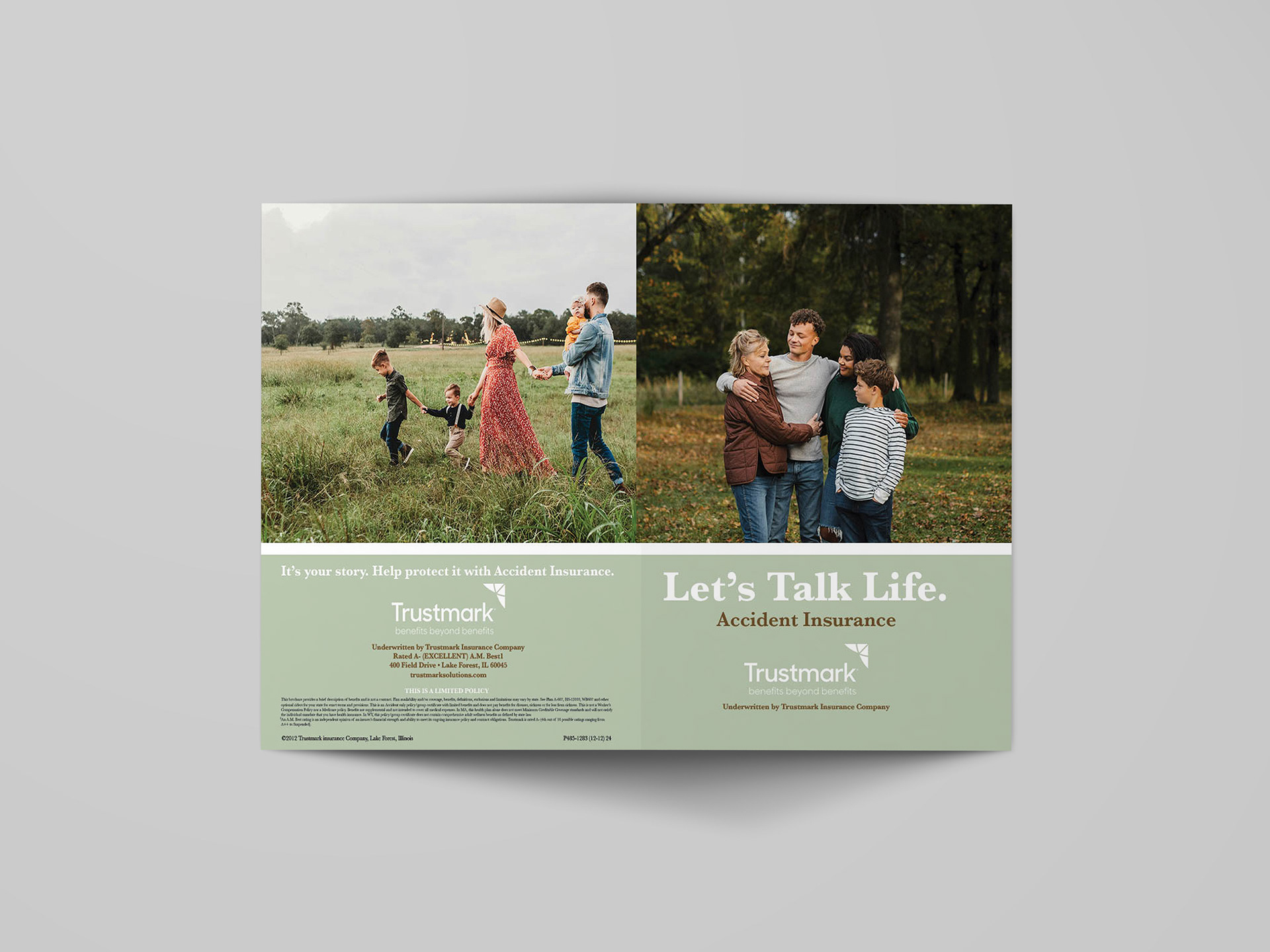
Lifestyle photography plays a significant role in the design. Images of families, couples, and everyday interactions are used to create emotional resonance and help readers connect the information to real-life scenarios. These visuals balance the more technical content, preventing the booklet from feeling overly clinical.
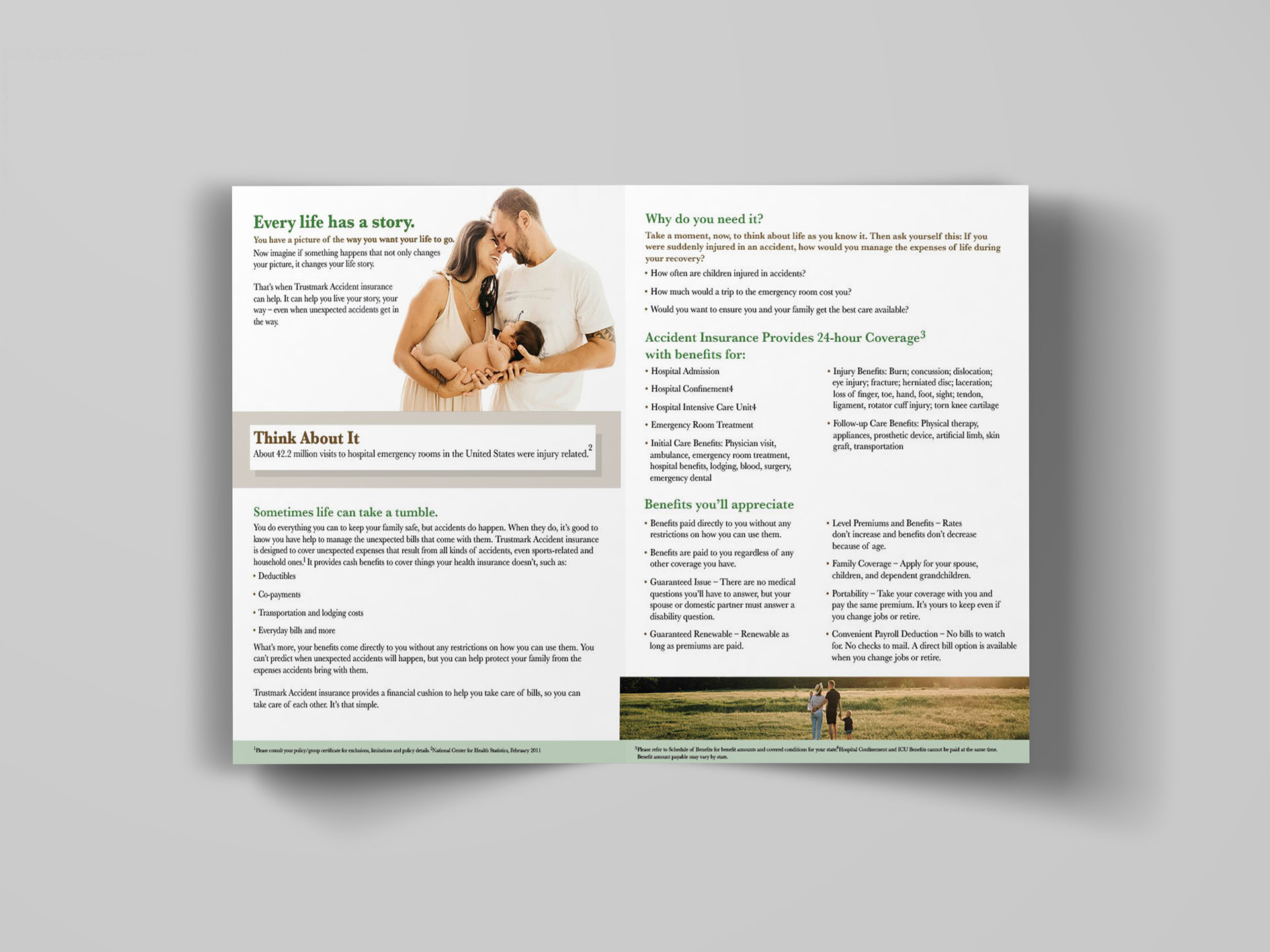
Structured layouts and grid systems ensure consistency across spreads. Elements such as section headers, dividers, and callout boxes help organize information and create a clear reading flow. Subtle shadows and spacing provide depth while maintaining a clean, professional aesthetic.
Typography & Layout
Typography is used strategically to establish hierarchy and improve readability. Serif and sans-serif combinations help differentiate headings from body text, creating a clear structure for scanning and reading. Larger headings draw attention to key sections like “Let’s Talk Life” and “Why do you need it?”, while smaller body text presents detailed information in a manageable format.
Typography is used strategically to establish hierarchy and improve readability. Serif and sans-serif combinations help differentiate headings from body text, creating a clear structure for scanning and reading. Larger headings draw attention to key sections like “Let’s Talk Life” and “Why do you need it?”, while smaller body text presents detailed information in a manageable format.
Bullet points, short paragraphs, and highlighted callout sections—such as “Think About It”—break up dense information and emphasize important statistics or key ideas. Consistent alignment and spacing ensure that the layout remains organized and easy to follow across all pages.
Content Organization
The booklet is divided into clearly defined sections that guide the reader through the purpose and benefits of accident insurance. Introductory spreads establish an emotional connection, while subsequent sections provide detailed information about coverage, benefits, and real-life considerations.
The booklet is divided into clearly defined sections that guide the reader through the purpose and benefits of accident insurance. Introductory spreads establish an emotional connection, while subsequent sections provide detailed information about coverage, benefits, and real-life considerations.
Key sections like “Why do you need it?” and “Benefits you’ll appreciate” are emphasized through hierarchy and placement, encouraging readers to engage more deeply with the content. The progression from general information to specific details creates a logical and intuitive reading experience.
Challenges
One of the main challenges was balancing large amounts of informational content with visual clarity. It was important to avoid overwhelming the reader while still including all necessary details. Another challenge involved integrating photography in a way that enhanced the message without distracting from the information.
One of the main challenges was balancing large amounts of informational content with visual clarity. It was important to avoid overwhelming the reader while still including all necessary details. Another challenge involved integrating photography in a way that enhanced the message without distracting from the information.
Maintaining consistency across multiple spreads while introducing enough variation to keep the design engaging also required careful attention to layout, spacing, and visual hierarchy.
Outcome & Applications
The final booklet successfully transforms complex insurance information into a clear, engaging, and user-friendly design. The combination of structured layouts, thoughtful typography, and relatable imagery creates a professional piece that builds trust and encourages reader engagement.
The final booklet successfully transforms complex insurance information into a clear, engaging, and user-friendly design. The combination of structured layouts, thoughtful typography, and relatable imagery creates a professional piece that builds trust and encourages reader engagement.
This project demonstrates a strong understanding of editorial design, information hierarchy, and brand communication. The booklet is well-suited for both print distribution and digital formats, such as downloadable PDFs, making it a versatile and effective tool for marketing and client education.