
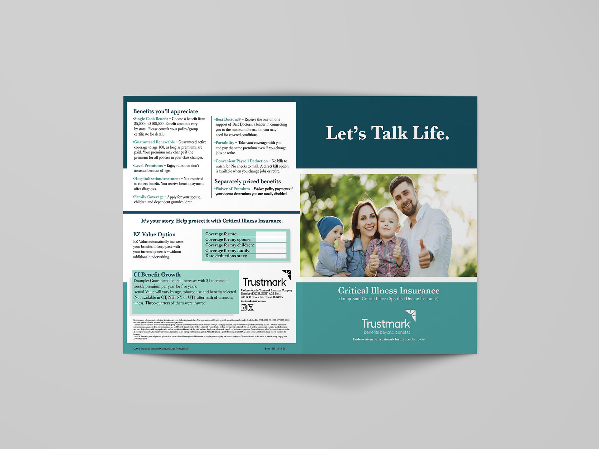
Front and Back Page
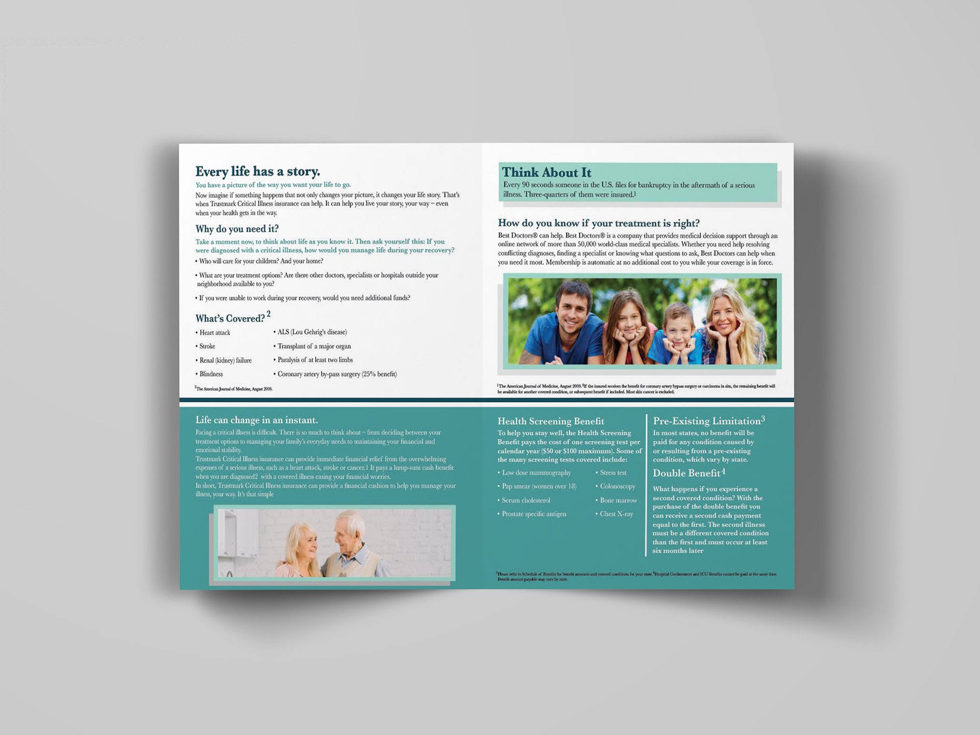
Project Overview
This editorial design project focuses on creating a clear, approachable, and informative booklet for critical illness insurance. The primary goal was to transform complex, technical, and often overwhelming information into a format that is easy to navigate, visually engaging, and accessible to a broad audience. The booklet is designed to simplify key topics—such as coverage benefits, qualifying medical conditions, and financial support—through thoughtful layout, strong hierarchy, and strategic use of visuals.
This editorial design project focuses on creating a clear, approachable, and informative booklet for critical illness insurance. The primary goal was to transform complex, technical, and often overwhelming information into a format that is easy to navigate, visually engaging, and accessible to a broad audience. The booklet is designed to simplify key topics—such as coverage benefits, qualifying medical conditions, and financial support—through thoughtful layout, strong hierarchy, and strategic use of visuals.
The Problem
Insurance materials are often dense, text-heavy, and difficult for the average reader to understand. This creates a barrier to engagement, leaving important information overlooked or misunderstood. The challenge was to present detailed and sometimes intimidating content in a way that feels clear, digestible, and trustworthy, without oversimplifying or losing essential information.
Insurance materials are often dense, text-heavy, and difficult for the average reader to understand. This creates a barrier to engagement, leaving important information overlooked or misunderstood. The challenge was to present detailed and sometimes intimidating content in a way that feels clear, digestible, and trustworthy, without oversimplifying or losing essential information.
Target Audience
The target audience includes adults and families who are exploring insurance options, many of whom may not have prior knowledge of critical illness coverage. This audience requires clarity, reassurance, and guidance, making it essential for the design to feel approachable, informative, and supportive rather than overly technical or clinical.
The target audience includes adults and families who are exploring insurance options, many of whom may not have prior knowledge of critical illness coverage. This audience requires clarity, reassurance, and guidance, making it essential for the design to feel approachable, informative, and supportive rather than overly technical or clinical.
Concept & Approach
The concept centers on clarity through structure. The design prioritizes readability and organization, ensuring that users can easily scan, navigate, and understand the information presented. Rather than overwhelming the reader with large blocks of text, the content is broken into manageable sections that guide the user through the material step by step.
The concept centers on clarity through structure. The design prioritizes readability and organization, ensuring that users can easily scan, navigate, and understand the information presented. Rather than overwhelming the reader with large blocks of text, the content is broken into manageable sections that guide the user through the material step by step.
The approach combines editorial design principles with a user-focused mindset, emphasizing accessibility, flow, and visual balance. Each spread is designed to feel open and inviting, encouraging continued reading.
Visual System & Design Elements
A consistent color palette of calming teal tones is used throughout the booklet to evoke trust, stability, and reassurance—qualities that are especially important in healthcare and insurance-related materials. This color system also helps unify the design across multiple pages.
A consistent color palette of calming teal tones is used throughout the booklet to evoke trust, stability, and reassurance—qualities that are especially important in healthcare and insurance-related materials. This color system also helps unify the design across multiple pages.
Typography plays a critical role in establishing hierarchy. Clear headings, subheadings, and body text styles are used to differentiate levels of information, allowing readers to quickly identify key points. Bullet points, short paragraphs, and callout sections are incorporated to break up dense content and improve readability.
Lifestyle imagery featuring families and everyday moments is integrated to create a sense of relatability and emotional connection. These visuals help humanize the subject matter, making the information feel more relevant and less abstract.
Content Organization & Layout
The booklet is structured into clearly defined sections, each focusing on a specific topic such as coverage details, benefits, and eligibility. Key sections like “Why do you need it?” and “Think About It” are emphasized through visual hierarchy and placement, drawing attention to important considerations and encouraging reader engagement.
The booklet is structured into clearly defined sections, each focusing on a specific topic such as coverage details, benefits, and eligibility. Key sections like “Why do you need it?” and “Think About It” are emphasized through visual hierarchy and placement, drawing attention to important considerations and encouraging reader engagement.
The layout carefully balances text and imagery, ensuring that no page feels overwhelming. White space is used effectively to create breathing room, while consistent alignment and grid systems maintain a professional and organized appearance.
Challenges
One of the main challenges was simplifying complex insurance terminology without losing accuracy or meaning. Striking the right balance between informative and approachable required careful editing and visual structuring. Another challenge involved maintaining reader engagement across multiple pages of informational content, which was addressed through variation in layout, strategic use of imagery, and clear sectioning. Ensuring consistency while avoiding monotony was also a key consideration.
One of the main challenges was simplifying complex insurance terminology without losing accuracy or meaning. Striking the right balance between informative and approachable required careful editing and visual structuring. Another challenge involved maintaining reader engagement across multiple pages of informational content, which was addressed through variation in layout, strategic use of imagery, and clear sectioning. Ensuring consistency while avoiding monotony was also a key consideration.
Outcome & Applications
The final booklet successfully communicates complex information in a clear, user-friendly format. The design enhances readability, supports comprehension, and creates a sense of trust through its clean aesthetic and structured layout.
The final booklet successfully communicates complex information in a clear, user-friendly format. The design enhances readability, supports comprehension, and creates a sense of trust through its clean aesthetic and structured layout.
This project demonstrates the ability to apply editorial design principles to real-world content, combining typography, layout, and visual consistency to produce a professional and engaging informational piece. The booklet is well-suited for print distribution in offices or clinics, as well as digital formats such as downloadable PDFs for online use.