
Drinks 1
Drinks 4
Mango Sunset
Blue Paradise Zero
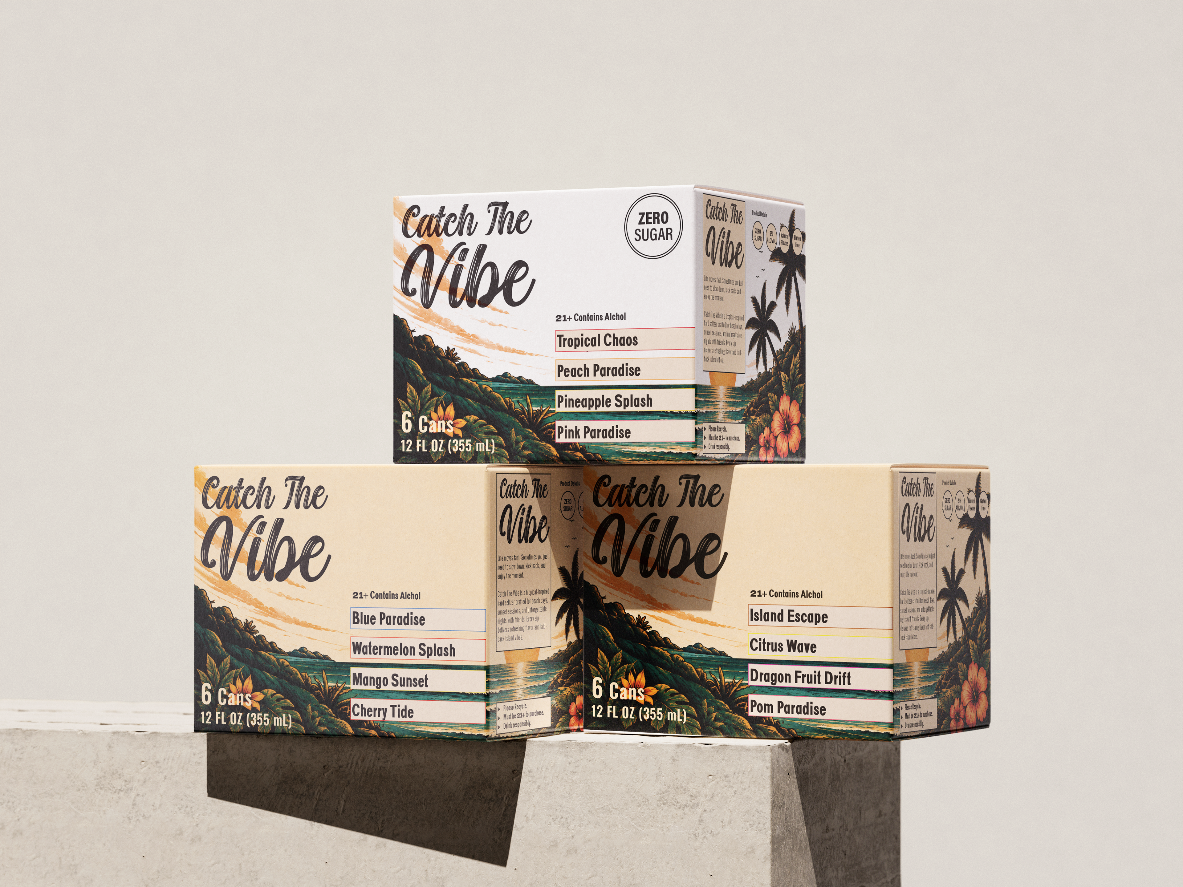
Box Mock Up
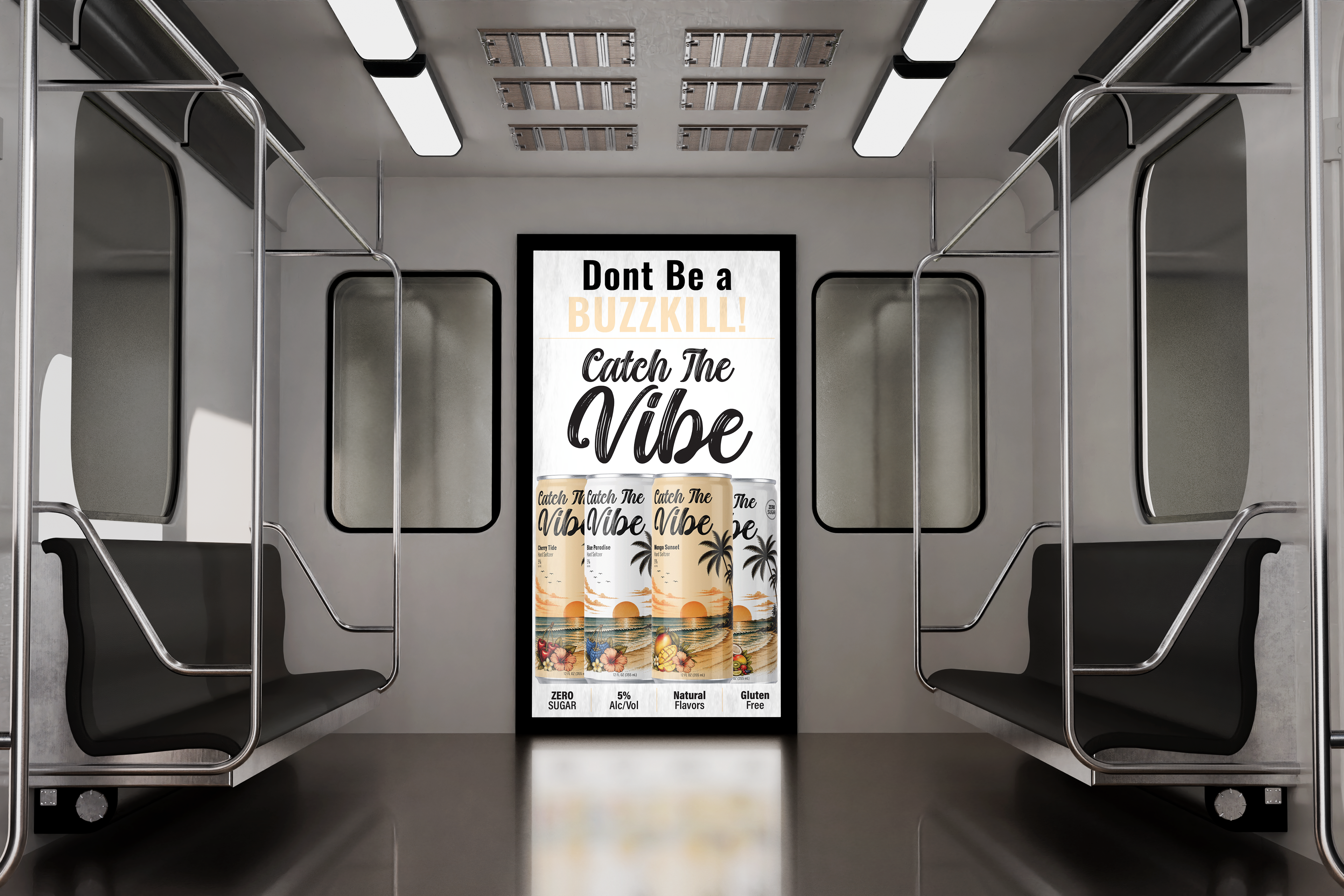
Poster
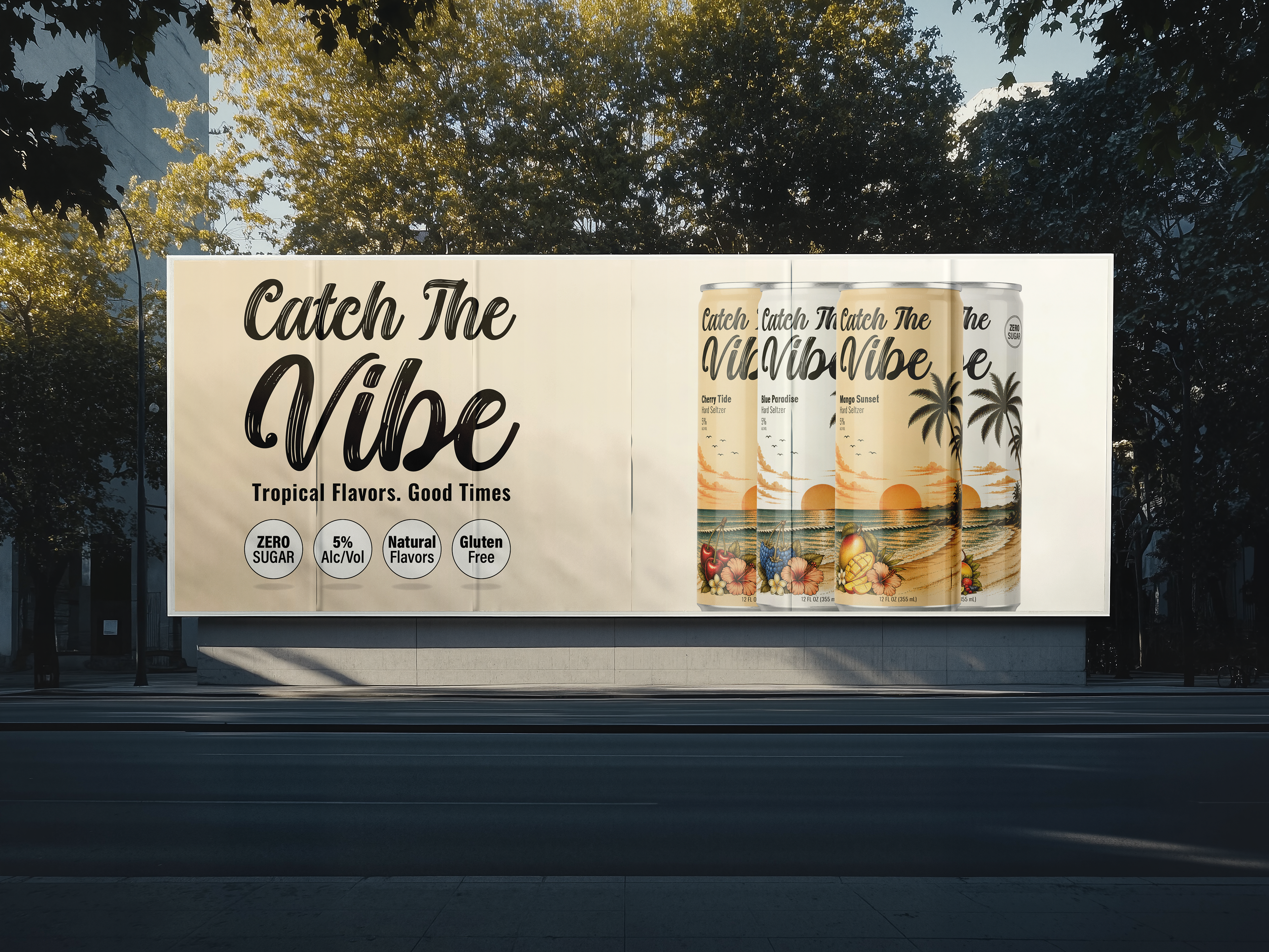
Billboard
Project Overview
This branding and packaging design project focuses on the creation of Catch The Vibe, a tropical-inspired hard seltzer brand that combines bold flavor identities with a relaxed beach aesthetic. The goal was to design a visually cohesive beverage line that captures the energy of summer, escapism, and social experiences while creating strong shelf appeal. The collection includes multiple flavor variations, each designed with consistent branding elements and custom fruit illustrations that reflect the personality of each drink.
The Problem
Many hard seltzer brands rely on overly minimal packaging or repetitive visual systems that fail to stand out in a saturated beverage market. The challenge for this project was to create packaging that feels vibrant, memorable, and emotionally engaging while still maintaining consistency across a multi-flavor product line. The design also needed to communicate flavor quickly and clearly while appealing to consumers looking for fun, refreshing, lifestyle-driven beverages.
Another challenge involved balancing decorative illustration with readability and brand recognition. Since beverage packaging competes heavily for attention on shelves and in social settings, the visual identity needed to instantly communicate the tropical, laid-back mood of the brand.
Target Audience
The target audience includes young adults and social consumers who enjoy casual, lifestyle-oriented beverages during gatherings, vacations, beach outings, and summer events. This audience is drawn to products that feel visually exciting, trendy, and experience-focused. The packaging needed to appeal to consumers who value both aesthetics and flavor variety while creating an emotional connection through imagery associated with relaxation, travel, and tropical escapes.
Concept & Approach
The concept behind Catch The Vibe centers on the feeling of “escaping into the moment.” Inspired by tropical sunsets, beaches, palm trees, and island vacations, the brand identity was designed to create an immersive visual experience that reflects relaxation, fun, and vibrant energy.
The design approach combines vintage-inspired illustration with modern typography to create packaging that feels both nostalgic and contemporary. Each flavor variation introduces unique fruit imagery while maintaining a unified tropical sunset environment, allowing the collection to feel cohesive as a complete product line.
The packaging system was designed so consumers could immediately recognize the brand while still distinguishing between flavors through illustrated fruit combinations and flavor naming.
Visual System & Design Elements
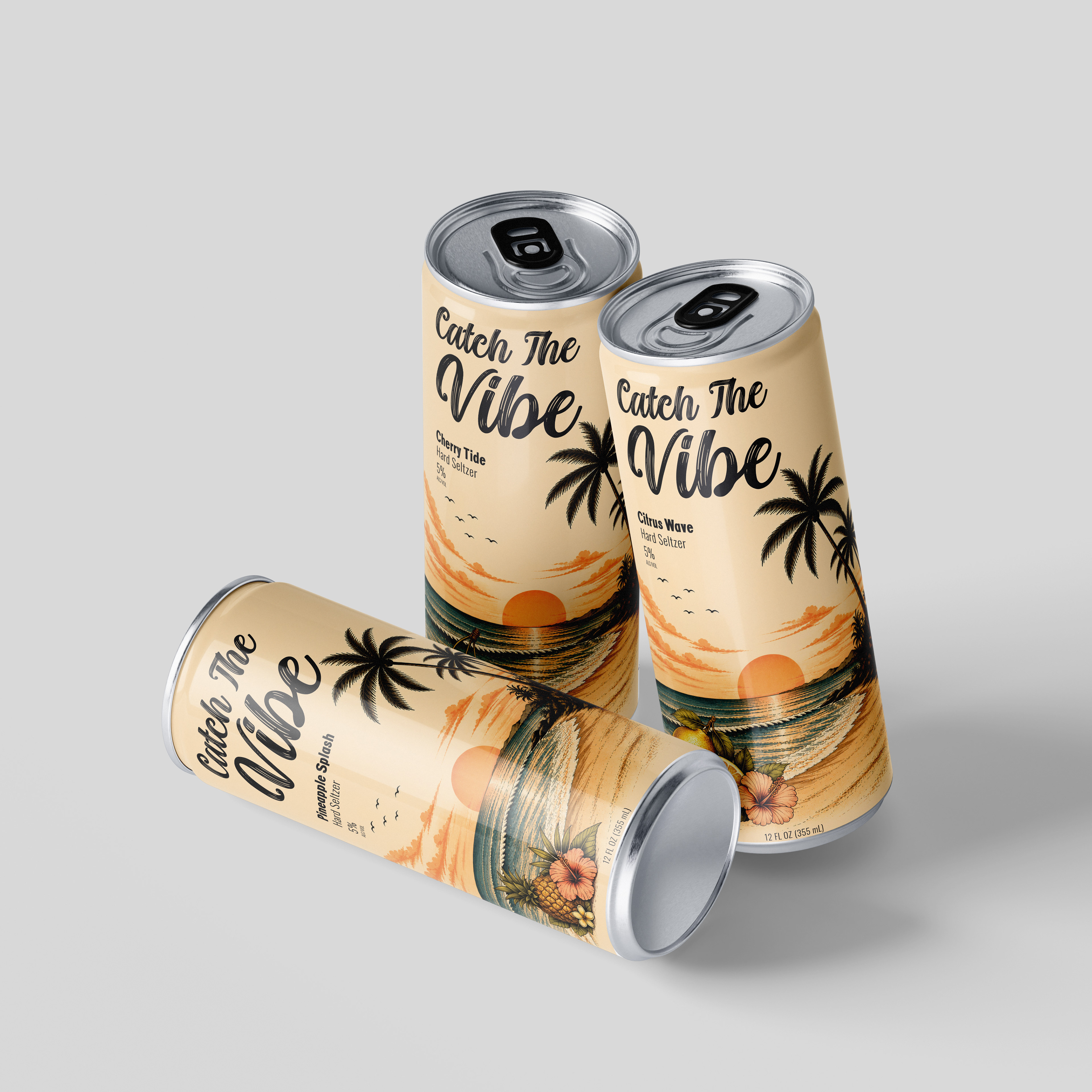
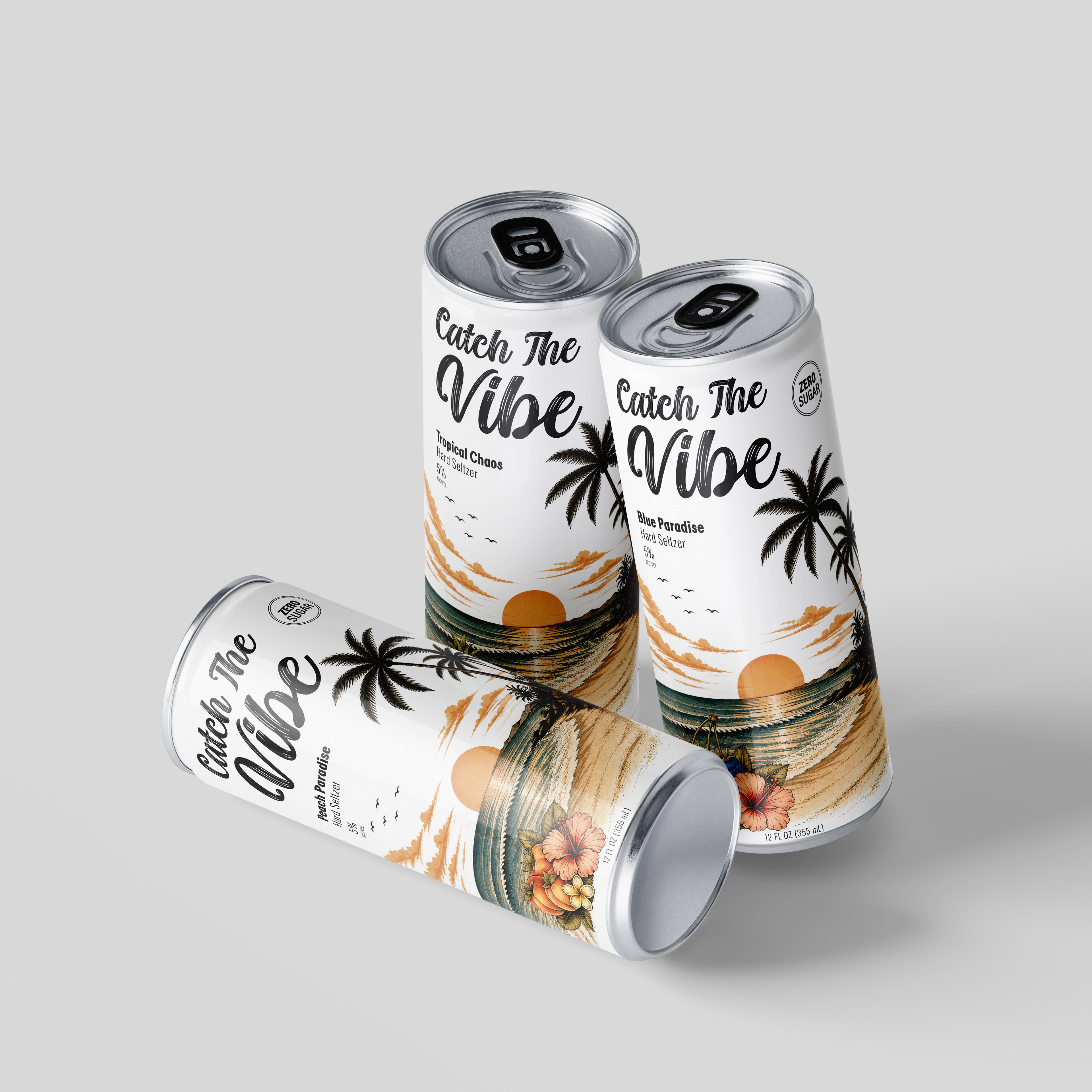
A cohesive visual system is established through warm sunset tones, tropical landscapes, and detailed fruit illustrations. The soft beige background creates a calm and inviting foundation while allowing the brighter oranges, blues, greens, reds, and yellows within the illustrations to stand out. This consistent palette reinforces the relaxed tropical atmosphere across all flavor variations.
The sunset beach scene serves as the primary visual anchor throughout the collection. Palm trees, ocean waves, clouds, and horizon lines create continuity and establish the brand’s vacation-inspired identity. These repeated environmental elements strengthen recognition while supporting the overall storytelling of the packaging.
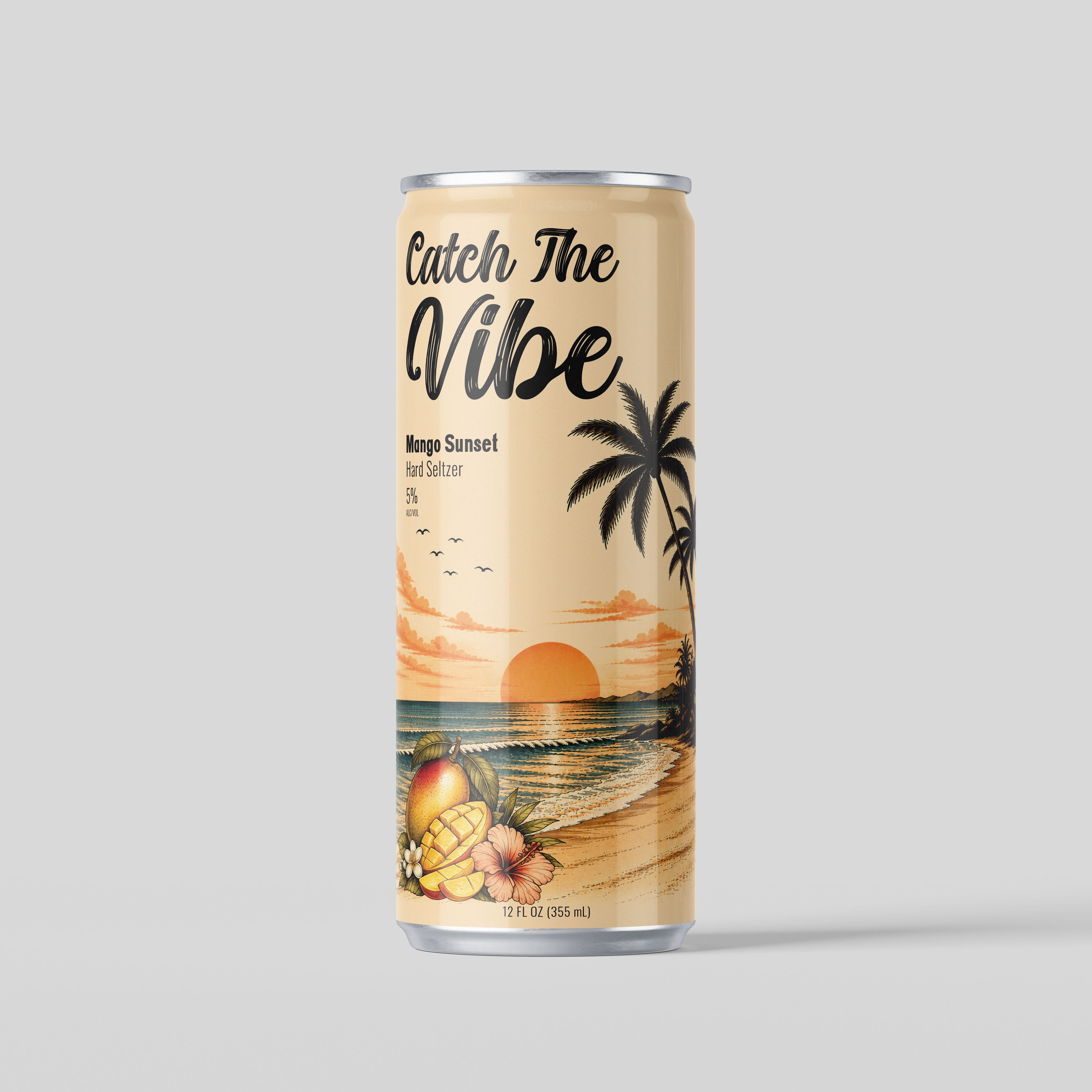
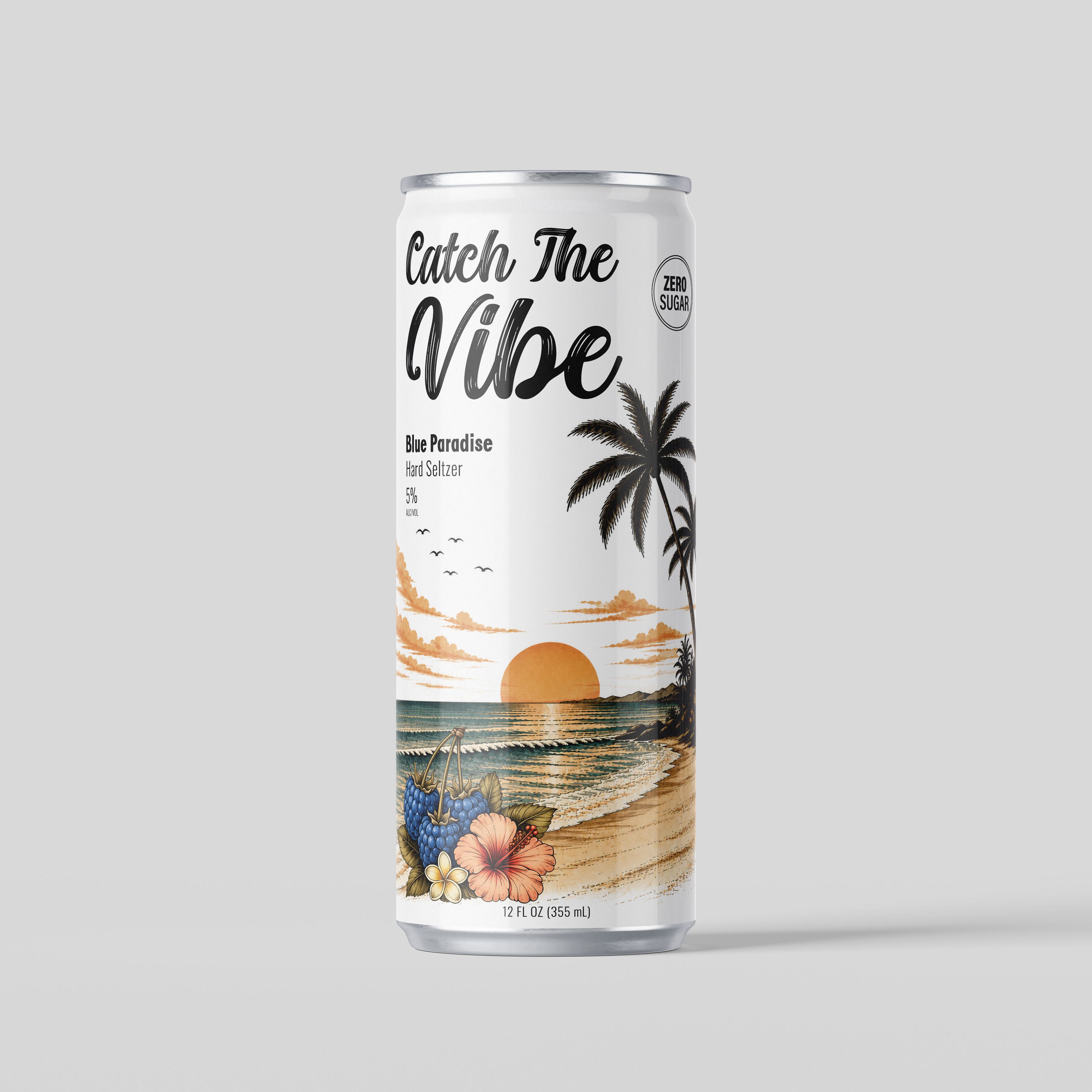
Custom fruit illustrations are used to differentiate each flavor, including citrus, cherry, pineapple, mango, peach, watermelon, and mixed tropical combinations. The detailed hand-drawn style adds personality and richness to the packaging, making the cans feel premium and visually engaging.
The can layout emphasizes balance and hierarchy. Large script typography at the top creates immediate brand recognition, while the flavor names and product information are positioned clearly beneath. The illustrations at the bottom ground the composition and guide the viewer’s eye naturally through the design.
Typography & Layout
Typography plays a major role in establishing the brand personality. The bold script logo creates an energetic and expressive feel that reflects the playful nature of the product. Its flowing movement reinforces the relaxed “vibe” theme while helping the brand stand out visually.
Sans-serif typography is used for flavor names and product details to create contrast and improve readability. The combination of decorative and clean typefaces creates a strong hierarchy that separates branding from informational content.
The layout maintains consistency across all cans by using a structured composition system. The logo remains dominant at the top, flavor details stay aligned in the upper left section, and the fruit illustrations consistently anchor the lower portion of the design. This organization allows each variation to feel unique without losing overall brand consistency.
Flavor Identity & Brand Expansion
Each flavor variation was designed to have its own personality while remaining connected to the larger Catch The Vibe identity. Flavor names such as Citrus Wave, Cherry Tide, Mango Sunset, Pink Paradise, and Tropical Chaos reinforce the tropical theme through descriptive, lifestyle-oriented naming.
The fruit illustrations help communicate flavor instantly while also contributing to the storytelling aspect of the brand. The variety within the collection demonstrates how the visual system can expand easily into additional flavors, seasonal editions, or promotional packaging while maintaining consistency.
Challenges
One of the main challenges was creating a packaging system that balanced consistency with variation. Since each flavor required unique visual elements, it was important to ensure that the collection still felt unified as a single brand.
Another challenge involved managing the level of illustration detail without overwhelming the layout. The tropical backgrounds, fruit elements, and typography needed to work together harmoniously while preserving readability and visual clarity.
Creating strong hierarchy on a narrow can format also required careful spacing, alignment, and scaling decisions to ensure the design remained impactful from multiple viewing distances.
Outcome & Applications
The final Catch The Vibe packaging collection successfully creates a vibrant and cohesive beverage brand identity that stands out visually while communicating flavor and atmosphere effectively. The combination of tropical imagery, expressive typography, and detailed illustrations results in packaging that feels energetic, immersive, and market-ready.
This project demonstrates a strong understanding of branding, packaging systems, illustration integration, typography, and visual storytelling. The flexible design system allows the brand to expand into additional flavors, merchandise, promotional materials, and digital marketing applications while maintaining a recognizable and engaging identity.