
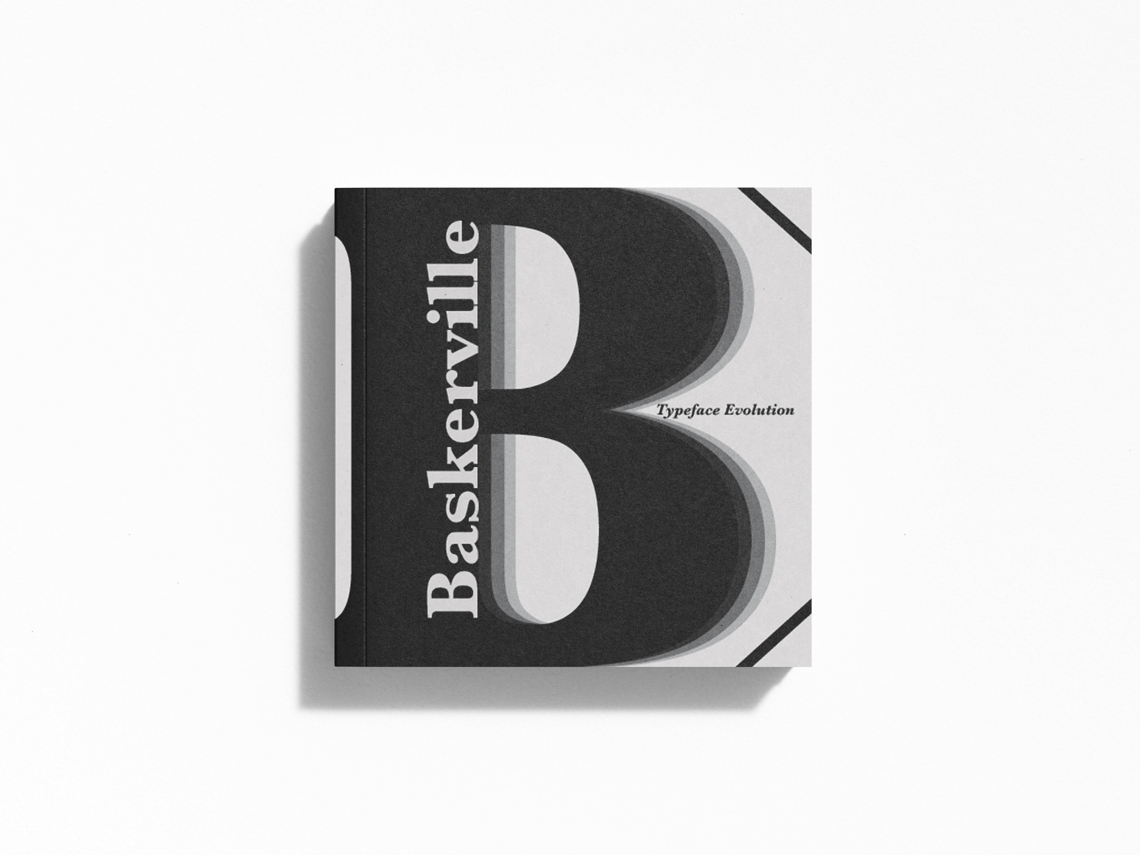
Front Cover
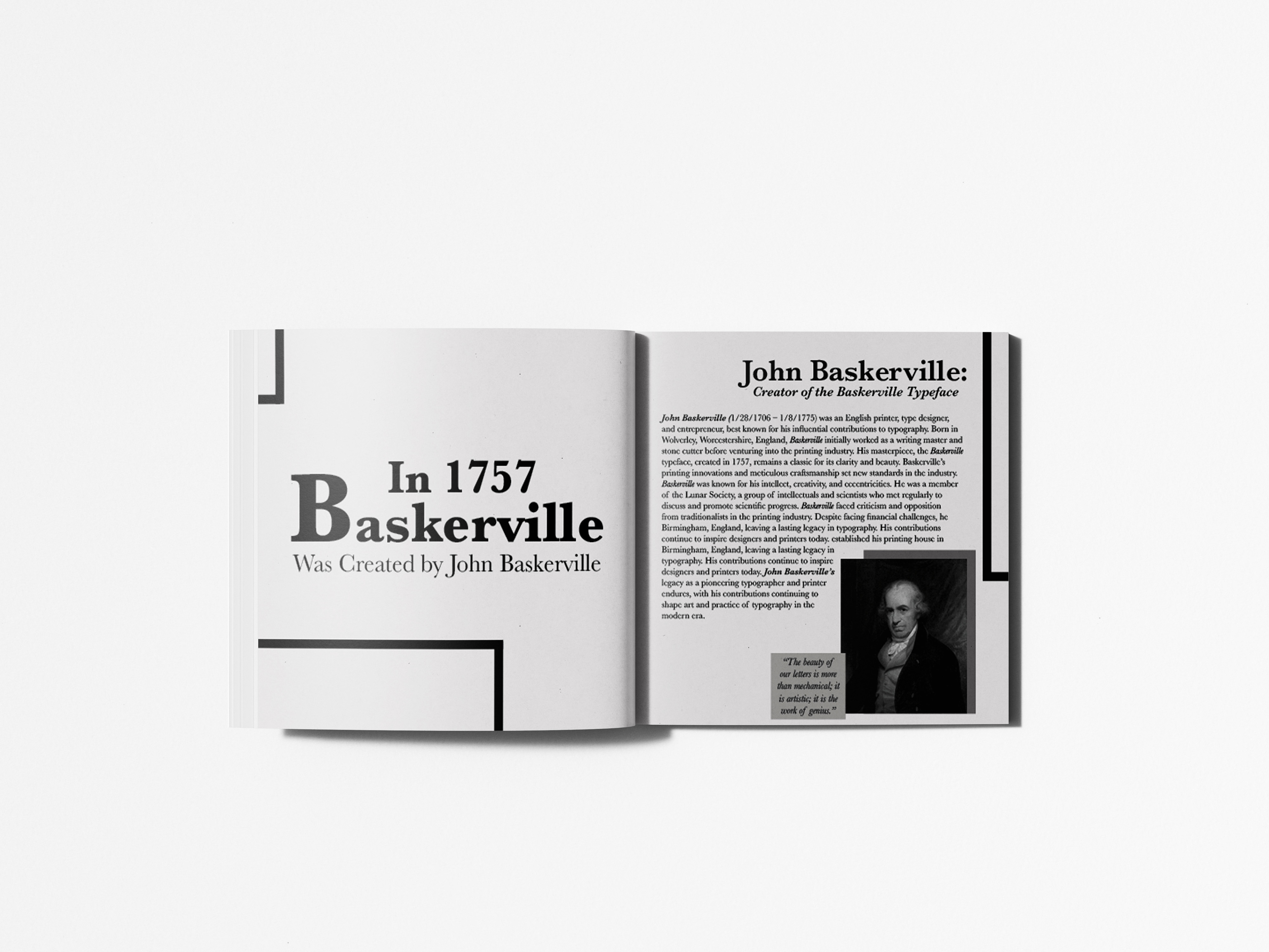
Page 1 & 2
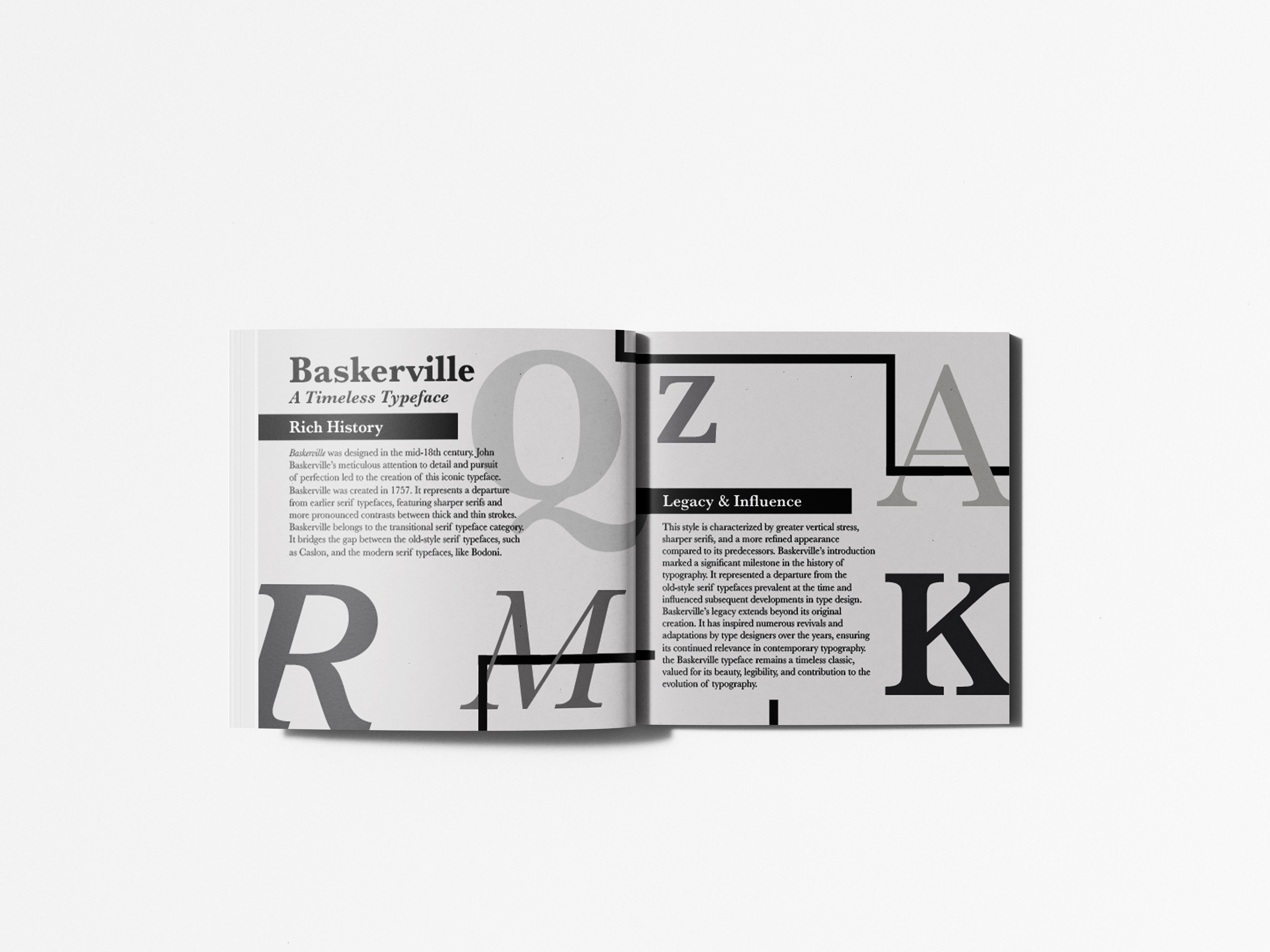
Page 3 & 4
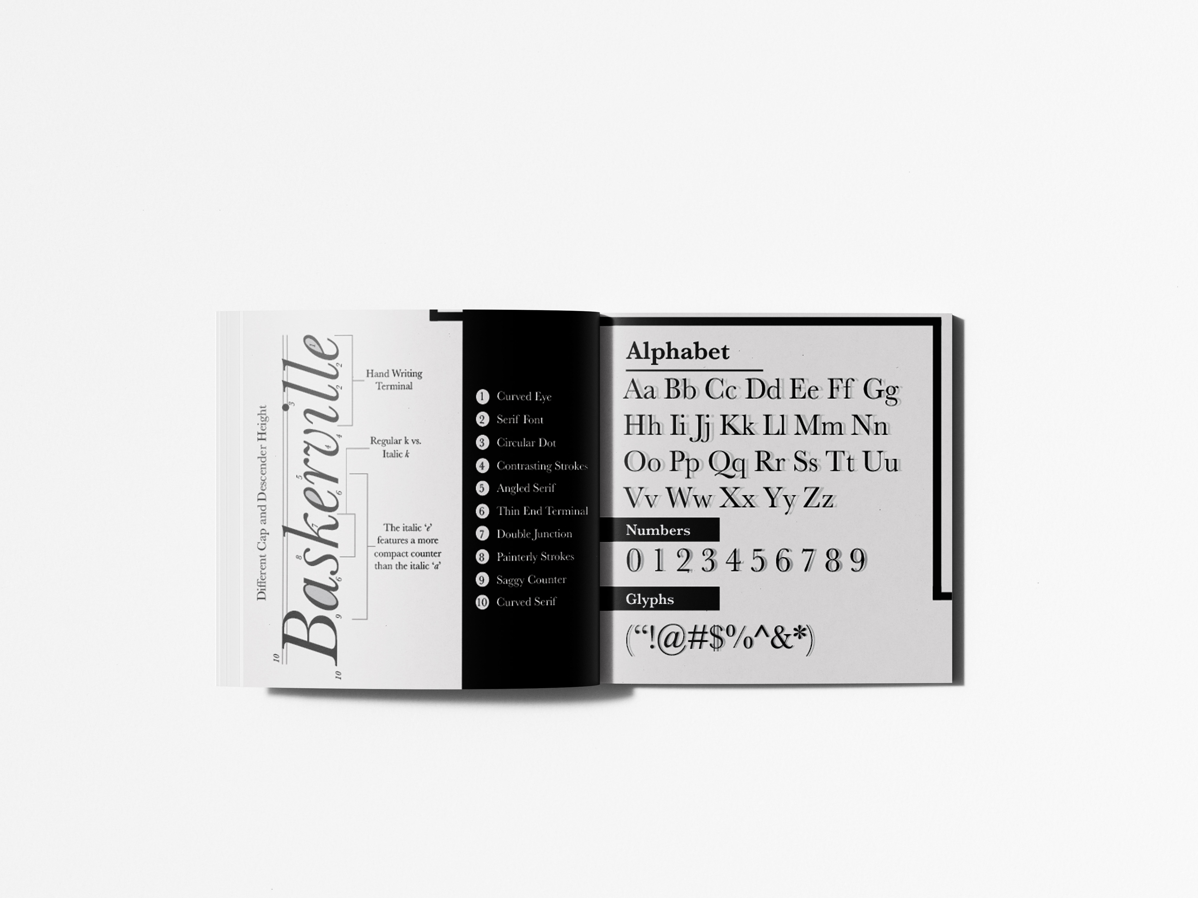
Page 5 & 6
Page 7 & 8
Page 9 & 10
Back Cover
Project Overview
This editorial design project explores the history, structure, and visual characteristics of the Baskerville typeface through a thoughtfully designed book layout. The goal was to create a visually engaging and informative publication that highlights both the historical significance and technical qualities of the typeface. By combining research, typography, and layout design, the project aims to educate readers while showcasing Baskerville as both a functional and expressive design element.
This editorial design project explores the history, structure, and visual characteristics of the Baskerville typeface through a thoughtfully designed book layout. The goal was to create a visually engaging and informative publication that highlights both the historical significance and technical qualities of the typeface. By combining research, typography, and layout design, the project aims to educate readers while showcasing Baskerville as both a functional and expressive design element.
The Problem
Typography-focused publications can often become overly technical or visually monotonous, making it difficult to engage readers who may not have a deep background in design. The challenge was to present detailed typographic information—such as anatomy, historical context, and stylistic features—in a way that is both accessible and visually compelling. Additionally, the design needed to reflect the elegance of Baskerville itself without overwhelming the content.
Typography-focused publications can often become overly technical or visually monotonous, making it difficult to engage readers who may not have a deep background in design. The challenge was to present detailed typographic information—such as anatomy, historical context, and stylistic features—in a way that is both accessible and visually compelling. Additionally, the design needed to reflect the elegance of Baskerville itself without overwhelming the content.
Target Audience
The target audience includes design students, typographers, and individuals interested in the history of graphic design. The book is also accessible to a broader audience with a general curiosity about typography, requiring a balance between educational depth and visual clarity.
The target audience includes design students, typographers, and individuals interested in the history of graphic design. The book is also accessible to a broader audience with a general curiosity about typography, requiring a balance between educational depth and visual clarity.
Concept & Approach
The concept centers on type as both subject and system. Baskerville is not only the focus of the content but also the primary visual voice of the book. The approach emphasizes clarity, structure, and refinement—qualities that reflect the characteristics of the typeface itself.
The concept centers on type as both subject and system. Baskerville is not only the focus of the content but also the primary visual voice of the book. The approach emphasizes clarity, structure, and refinement—qualities that reflect the characteristics of the typeface itself.
The design uses Baskerville throughout the publication to reinforce its identity, allowing readers to experience the typeface directly while learning about its features. The layouts are intentionally clean and structured, mirroring the precision and elegance associated with Baskerville’s transitional style.
Visual System & Design Elements
A consistent visual system is established through the use of grid-based layouts, controlled spacing, and a restrained color palette. The design relies heavily on typography as the main visual element, allowing the form of the letters to take center stage.
A consistent visual system is established through the use of grid-based layouts, controlled spacing, and a restrained color palette. The design relies heavily on typography as the main visual element, allowing the form of the letters to take center stage.
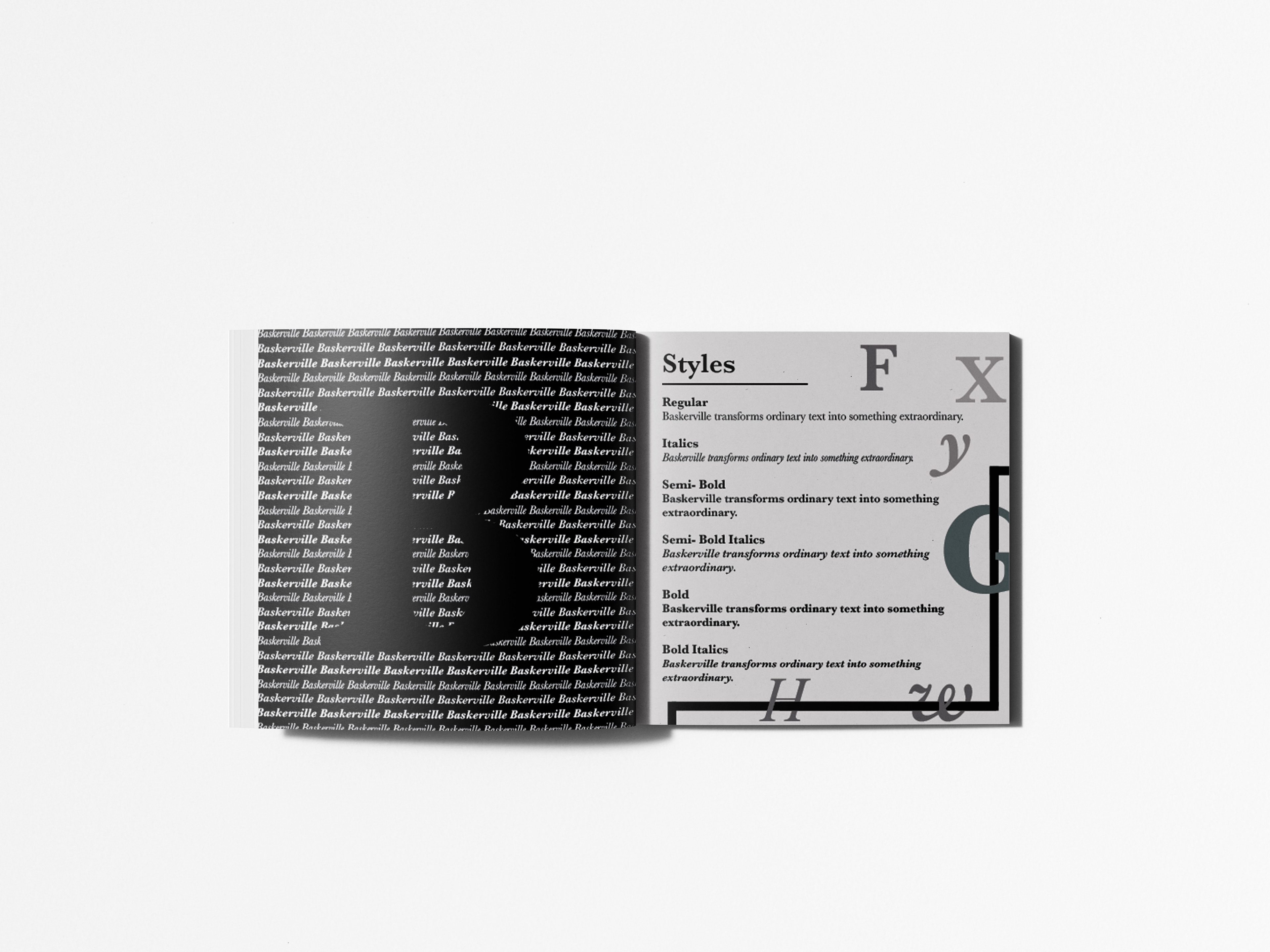
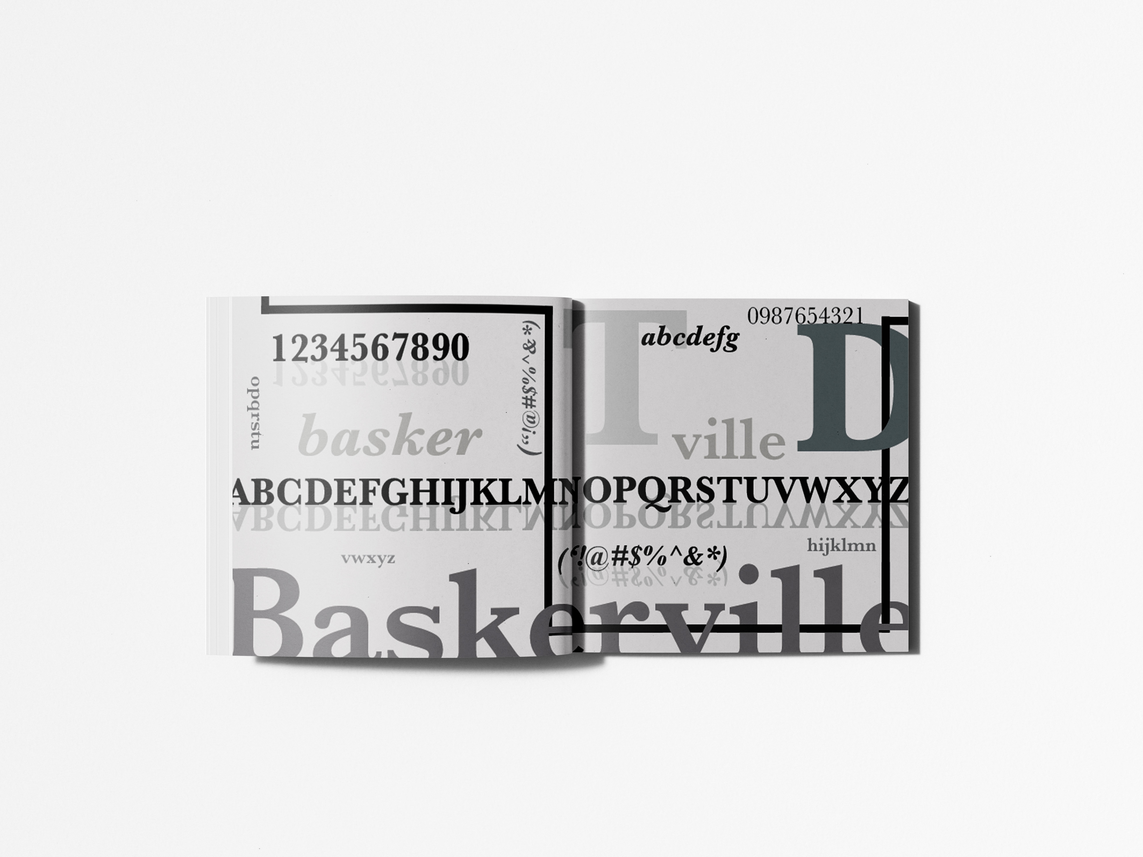
Key features of Baskerville—such as high contrast between thick and thin strokes, refined serifs, and balanced proportions—are highlighted through large-scale type specimens and detailed visual examples. Alphabet sets, glyph charts, and anatomical diagrams are incorporated to illustrate both the structure and functionality of the typeface.
The use of scale variation—ranging from large display type to smaller body text—creates visual interest while reinforcing hierarchy. Subtle graphic elements and rules are used sparingly to organize content without distracting from the typography.
Typography & Layout
Typography is the foundation of the design. A clear hierarchy is established through the use of headings, subheadings, body text, and captions, all set in Baskerville or complementary typefaces where appropriate. This hierarchy guides the reader through the content in a logical and intuitive way.
Typography is the foundation of the design. A clear hierarchy is established through the use of headings, subheadings, body text, and captions, all set in Baskerville or complementary typefaces where appropriate. This hierarchy guides the reader through the content in a logical and intuitive way.
The layouts are carefully structured to balance text and imagery. White space is used intentionally to create breathing room, improving readability and emphasizing key information. Consistent margins, alignment, and column structures ensure a cohesive reading experience across all pages.
Content Organization
The book is divided into clearly defined sections that guide the reader through different aspects of the typeface. These include the historical background of John Baskerville, the evolution of the typeface, its defining characteristics, and its practical applications.
The book is divided into clearly defined sections that guide the reader through different aspects of the typeface. These include the historical background of John Baskerville, the evolution of the typeface, its defining characteristics, and its practical applications.
Each section builds upon the previous one, creating a narrative flow that moves from context to analysis. Visual examples are integrated throughout to support the written content, helping readers better understand both the form and function of the typeface.
Challenges
One of the main challenges was maintaining visual interest while working within a restrained and typography-driven design system. Avoiding monotony required thoughtful variation in layout, scale, and composition. Another challenge involved balancing educational content with visual design, ensuring that the information remained clear and digestible without sacrificing aesthetic quality.
One of the main challenges was maintaining visual interest while working within a restrained and typography-driven design system. Avoiding monotony required thoughtful variation in layout, scale, and composition. Another challenge involved balancing educational content with visual design, ensuring that the information remained clear and digestible without sacrificing aesthetic quality.
Additionally, using Baskerville as both the subject and primary typeface required careful handling to ensure readability across different sizes and contexts.
Outcome & Applications
The final result is a cohesive and well-structured editorial piece that effectively communicates the history and design of the Baskerville typeface. The book successfully combines research, typography, and layout to create an engaging and educational experience.
The final result is a cohesive and well-structured editorial piece that effectively communicates the history and design of the Baskerville typeface. The book successfully combines research, typography, and layout to create an engaging and educational experience.
This project demonstrates a strong understanding of typographic systems and editorial design principles. The final publication is suitable for both print and digital formats, serving as an informative resource as well as a visually compelling example of type-driven design.