
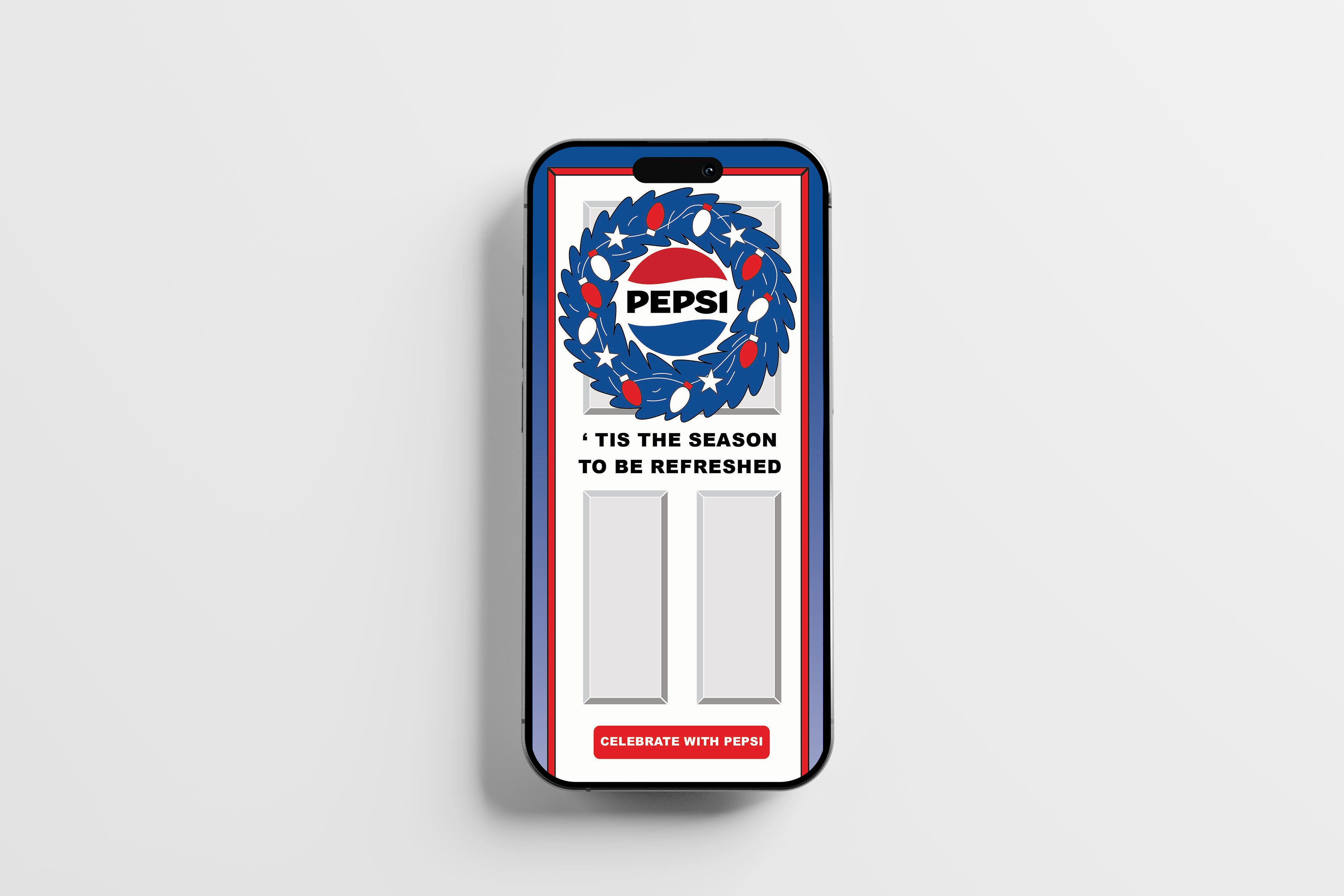
Pepsi App Ad
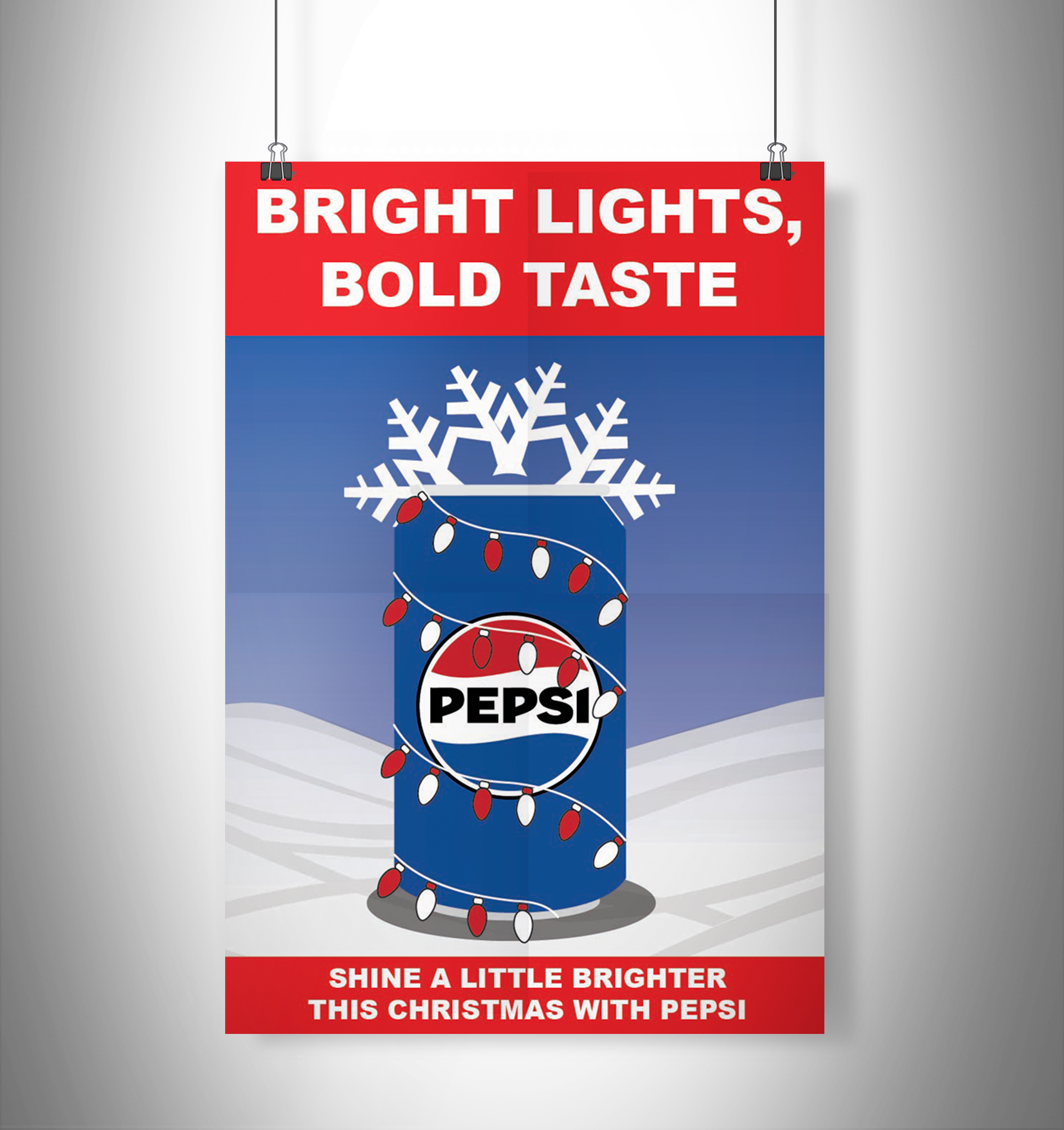
Pepsi Poster
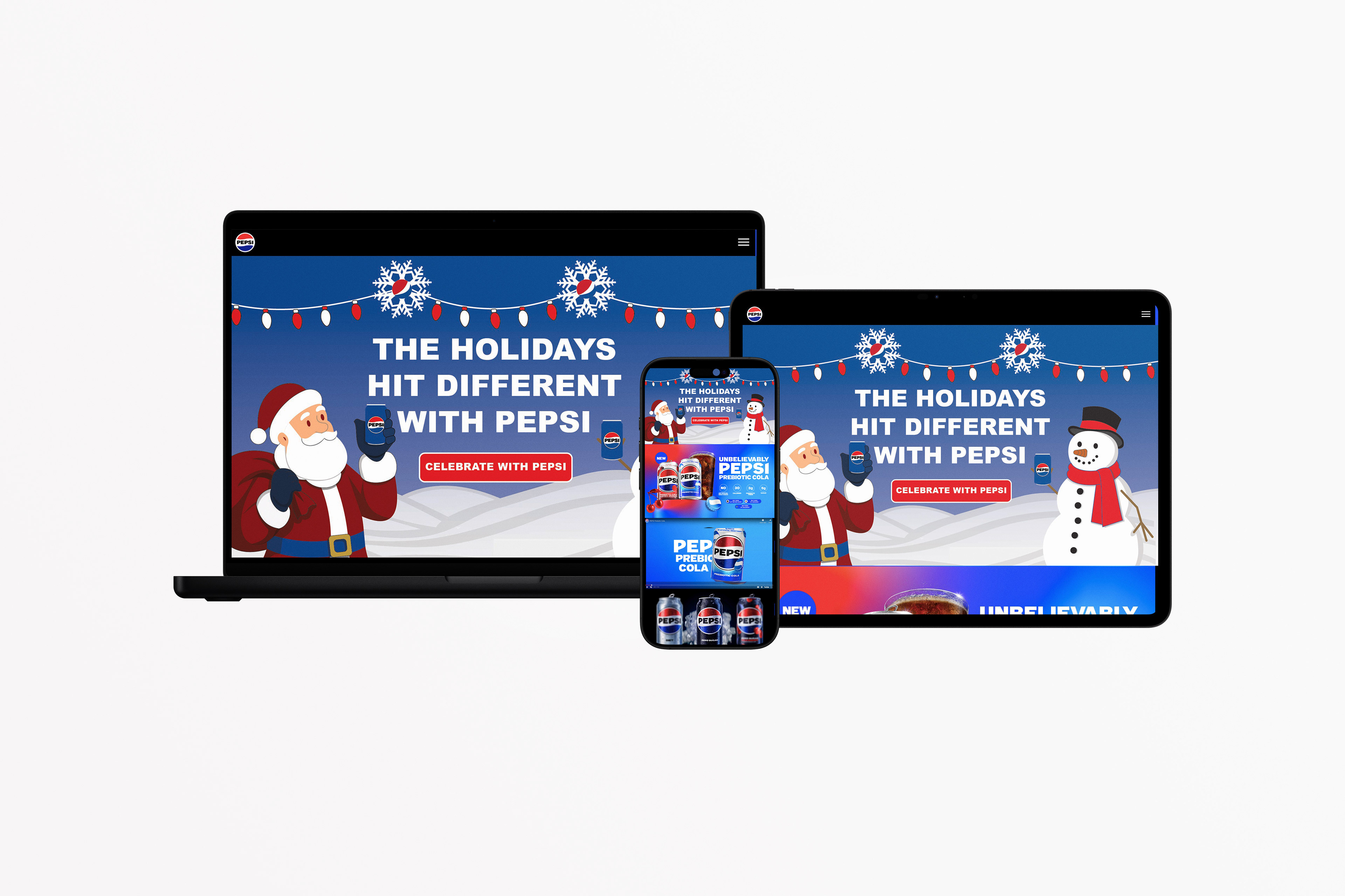
Pepsi Website Hero Image
Project Overview
This project is a holiday-themed advertising campaign created for Pepsi, centered around festive visuals and bold, engaging messaging. The objective was to design a cohesive series of promotional graphics that capture the energy and excitement of the holiday season while remaining aligned with Pepsi’s established brand identity. The campaign blends seasonal charm with a modern advertising approach, resulting in visuals that feel both recognizable and fresh.
The Problem
Holiday advertising is highly saturated, with many brands relying on similar visual tropes such as snow, ornaments, and warm lighting. The challenge was to create a campaign that stands out within this crowded space while still feeling unmistakably “holiday-themed.” At the same time, the designs needed to stay consistent with Pepsi’s bold, high-contrast visual identity, ensuring that the brand remains the focal point rather than being overshadowed by seasonal elements.
Holiday advertising is highly saturated, with many brands relying on similar visual tropes such as snow, ornaments, and warm lighting. The challenge was to create a campaign that stands out within this crowded space while still feeling unmistakably “holiday-themed.” At the same time, the designs needed to stay consistent with Pepsi’s bold, high-contrast visual identity, ensuring that the brand remains the focal point rather than being overshadowed by seasonal elements.
Target Audience
The target audience includes a broad but youthful demographic—primarily teens and young adults who are active on social media and responsive to bold, visually driven campaigns. The work is designed to appeal to consumers who associate the holidays with excitement, celebration, and shared experiences, aligning Pepsi with moments of joy and connection.
The target audience includes a broad but youthful demographic—primarily teens and young adults who are active on social media and responsive to bold, visually driven campaigns. The work is designed to appeal to consumers who associate the holidays with excitement, celebration, and shared experiences, aligning Pepsi with moments of joy and connection.
Concept & Approach
The concept centers on the idea that “the holidays hit different with Pepsi,” positioning the brand as an essential part of festive experiences. The campaign emphasizes energy, brightness, and flavor as key emotional drivers, using vibrant visuals and playful compositions to reflect the excitement of the season.
The concept centers on the idea that “the holidays hit different with Pepsi,” positioning the brand as an essential part of festive experiences. The campaign emphasizes energy, brightness, and flavor as key emotional drivers, using vibrant visuals and playful compositions to reflect the excitement of the season.
Rather than leaning into overly traditional or nostalgic holiday aesthetics, the approach introduces a more contemporary and graphic interpretation. This allows the campaign to feel current and aligned with Pepsi’s energetic brand voice while still incorporating recognizable seasonal cues.
Visual System & Design Elements
The visual system combines classic holiday elements—such as snowflakes, string lights, wreaths, and seasonal characters—with Pepsi’s signature red, white, and blue palette. These elements are stylized to match a bold, graphic illustration approach, ensuring consistency across all pieces.
The visual system combines classic holiday elements—such as snowflakes, string lights, wreaths, and seasonal characters—with Pepsi’s signature red, white, and blue palette. These elements are stylized to match a bold, graphic illustration approach, ensuring consistency across all pieces.
Typography plays a central role in the campaign. Bold, high-impact type is used to deliver catchy, memorable taglines like “The Holidays Hit Different with Pepsi” and “Bright Lights, Bold Taste.” The typography is designed to create strong visual hierarchy, guiding the viewer’s attention while reinforcing the energetic tone of the campaign.
Each design maintains a consistent layout structure, including clear focal points, balanced compositions, and strategic placement of branding elements such as the Pepsi logo and product imagery. Bright highlights and glowing effects—particularly in the string lights—add depth and enhance the festive atmosphere.
Variation Within the System
While consistency is key, variation is introduced through multiple visual storytelling approaches. Some pieces are character-driven, featuring playful holiday figures interacting with Pepsi products, while others focus more directly on the product itself through bold, simplified compositions. Decorative layouts incorporating patterns and seasonal motifs provide additional diversity within the series.
While consistency is key, variation is introduced through multiple visual storytelling approaches. Some pieces are character-driven, featuring playful holiday figures interacting with Pepsi products, while others focus more directly on the product itself through bold, simplified compositions. Decorative layouts incorporating patterns and seasonal motifs provide additional diversity within the series.
This balance between consistency and variation ensures that each design feels unique while still contributing to a unified campaign identity.
Challenges
One of the primary challenges was balancing holiday visuals with brand visibility. It was important to ensure that seasonal elements enhanced rather than distracted from the Pepsi product. Another challenge involved maintaining consistency across multiple compositions while avoiding repetition, requiring careful control of layout, color distribution, and visual hierarchy. Additionally, integrating typography in a way that felt both bold and harmonious with the illustrations required thoughtful refinement.
One of the primary challenges was balancing holiday visuals with brand visibility. It was important to ensure that seasonal elements enhanced rather than distracted from the Pepsi product. Another challenge involved maintaining consistency across multiple compositions while avoiding repetition, requiring careful control of layout, color distribution, and visual hierarchy. Additionally, integrating typography in a way that felt both bold and harmonious with the illustrations required thoughtful refinement.
Outcome & Applications
The final campaign successfully delivers a cohesive and visually engaging series of holiday advertisements. Each piece captures the festive spirit while reinforcing Pepsi’s bold and energetic brand identity. The campaign is versatile and can be applied across various platforms, including social media, digital ads, posters, and in-store displays.
The final campaign successfully delivers a cohesive and visually engaging series of holiday advertisements. Each piece captures the festive spirit while reinforcing Pepsi’s bold and energetic brand identity. The campaign is versatile and can be applied across various platforms, including social media, digital ads, posters, and in-store displays.
Overall, the project demonstrates a strong ability to merge illustration, branding, and typography into a unified advertising system that communicates a clear seasonal message while enhancing brand recognition and audience engagement.