
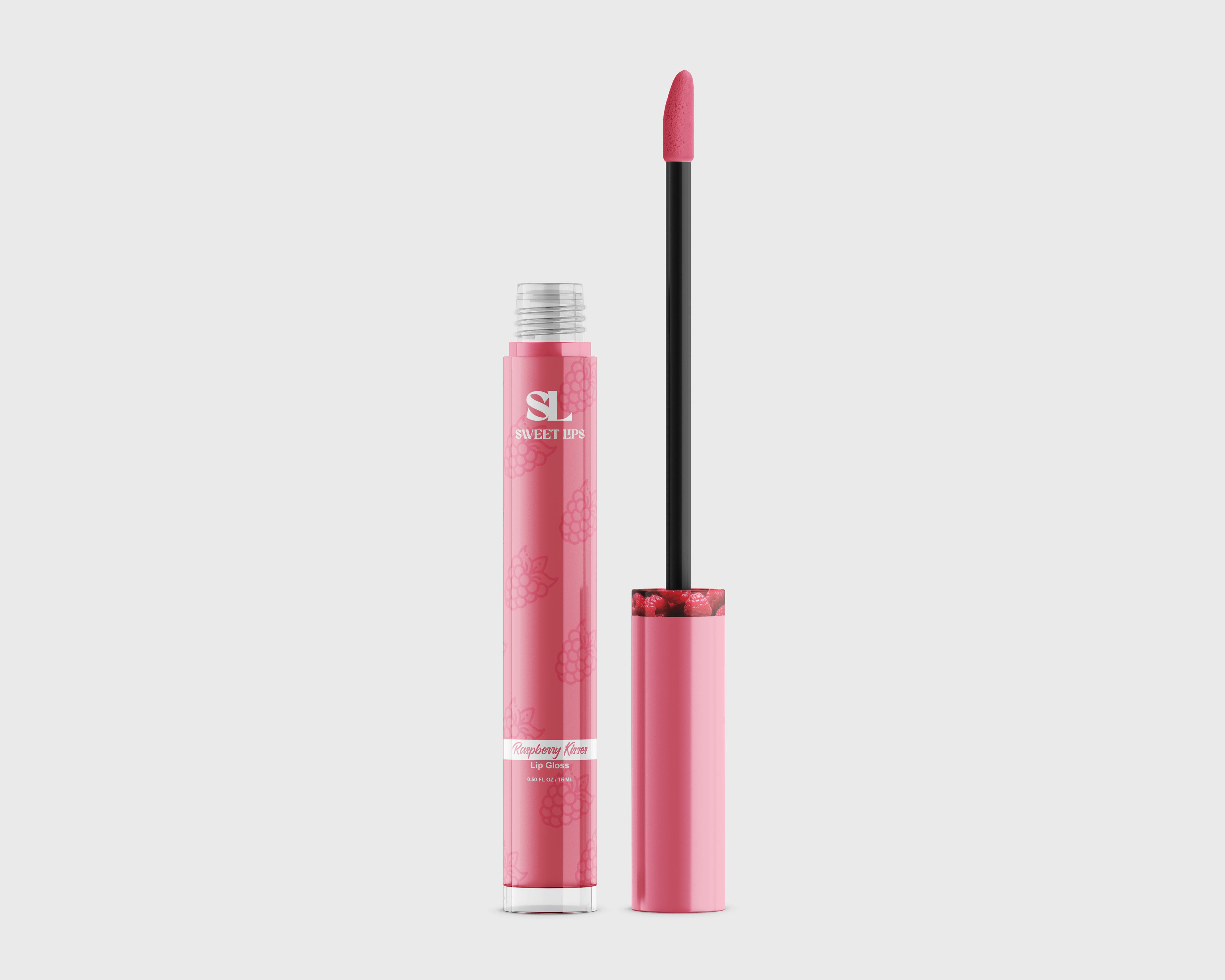
Lip Gloss
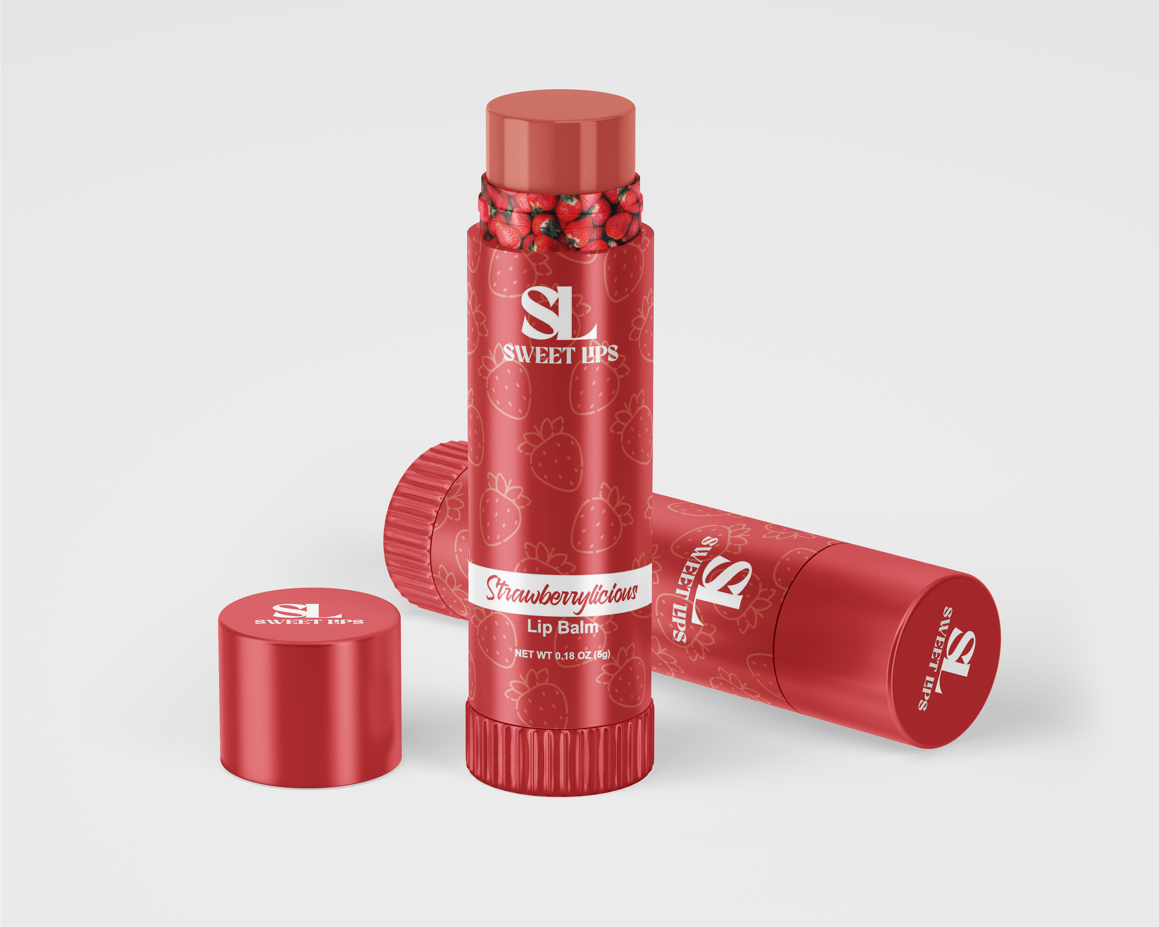
Lip Balm

Project Overview
This packaging design project for the Sweet Lips brand explores the creation of a cohesive and playful visual system across a line of lip care products, including lip gloss, lip balm, and lip scrub. The goal was to develop packaging that feels visually unified while clearly distinguishing between product types and flavors. The designs are inspired by fruit-based themes such as Raspberry Kisses, Strawberrylicious, and Tropical Peach, resulting in a vibrant and engaging product line that aligns with current beauty and lifestyle trends.
This packaging design project for the Sweet Lips brand explores the creation of a cohesive and playful visual system across a line of lip care products, including lip gloss, lip balm, and lip scrub. The goal was to develop packaging that feels visually unified while clearly distinguishing between product types and flavors. The designs are inspired by fruit-based themes such as Raspberry Kisses, Strawberrylicious, and Tropical Peach, resulting in a vibrant and engaging product line that aligns with current beauty and lifestyle trends.
The Problem
In product packaging, especially within the beauty industry, brands must balance consistency with differentiation. Consumers need to quickly recognize the brand while also being able to distinguish between product variations such as flavor, function, and type. The challenge was to create a system that maintains a strong, recognizable brand identity across all products while ensuring that each variation feels unique, clear, and visually appealing on its own.
In product packaging, especially within the beauty industry, brands must balance consistency with differentiation. Consumers need to quickly recognize the brand while also being able to distinguish between product variations such as flavor, function, and type. The challenge was to create a system that maintains a strong, recognizable brand identity across all products while ensuring that each variation feels unique, clear, and visually appealing on its own.
Target Audience
The target audience consists primarily of a younger, beauty-focused demographic—teens and young adults who are drawn to fun, colorful, and trend-driven products. This audience is highly influenced by social media aesthetics, packaging design, and brand personality, making it essential for the designs to feel playful, approachable, and visually shareable.
The target audience consists primarily of a younger, beauty-focused demographic—teens and young adults who are drawn to fun, colorful, and trend-driven products. This audience is highly influenced by social media aesthetics, packaging design, and brand personality, making it essential for the designs to feel playful, approachable, and visually shareable.
Concept & Approach
The concept centers on flavor-driven identity, where each product variation is visually inspired by its corresponding fruit flavor. This approach allows the packaging to feel intuitive and engaging, with immediate visual cues that communicate scent and experience.
The concept centers on flavor-driven identity, where each product variation is visually inspired by its corresponding fruit flavor. This approach allows the packaging to feel intuitive and engaging, with immediate visual cues that communicate scent and experience.
At the same time, the overall system emphasizes brand cohesion. By establishing a consistent layout and repeating key visual elements, the design ensures that all products are clearly part of the Sweet Lips line, regardless of flavor or product type.
Visual System & Design Elements
A strong visual system is established through the use of coordinated color palettes, fruit-based patterns, and illustrative icons. Each flavor is represented through a distinct color scheme—such as rich berry tones for raspberry, bright reds for strawberry, and warm peach hues—paired with corresponding fruit imagery.
A strong visual system is established through the use of coordinated color palettes, fruit-based patterns, and illustrative icons. Each flavor is represented through a distinct color scheme—such as rich berry tones for raspberry, bright reds for strawberry, and warm peach hues—paired with corresponding fruit imagery.
The packaging features a consistent structural layout across all products. A bold “SL” monogram acts as a central branding element, while centered typography creates a clean and balanced composition. Clear typographic hierarchy ensures that product names, flavors, and key details are easy to read and quickly understood.
Repeating elements such as patterned backgrounds, soft gradients, and script-style typography reinforce the brand’s playful and feminine identity. These elements create visual continuity while allowing room for variation within each product.
Typography & Layout
Typography plays a key role in establishing both personality and clarity. Script-style type is used to convey a sense of softness and approachability, aligning with the beauty-focused nature of the brand. This is paired with more structured, legible type for product details to maintain readability.
Typography plays a key role in establishing both personality and clarity. Script-style type is used to convey a sense of softness and approachability, aligning with the beauty-focused nature of the brand. This is paired with more structured, legible type for product details to maintain readability.
The layout is intentionally consistent across all packaging, using alignment and spacing to create a polished and professional appearance. This consistency strengthens brand recognition and ensures that the products feel like part of a unified system when displayed together.
Challenges
One of the main challenges was balancing playful, decorative elements with clarity and functionality. While vibrant patterns and colors are visually appealing, they needed to be carefully controlled to avoid overwhelming the information. Another challenge involved creating enough variation between flavors without breaking the overall brand identity. Maintaining consistency across different product formats (gloss, balm, scrub) also required thoughtful adaptation of the design system.
One of the main challenges was balancing playful, decorative elements with clarity and functionality. While vibrant patterns and colors are visually appealing, they needed to be carefully controlled to avoid overwhelming the information. Another challenge involved creating enough variation between flavors without breaking the overall brand identity. Maintaining consistency across different product formats (gloss, balm, scrub) also required thoughtful adaptation of the design system.
Outcome & Applications
The final result is a cohesive packaging system that successfully balances branding consistency with product differentiation. Each item is visually distinct through color and flavor cues, yet clearly connected through shared layout, typography, and graphic elements.
The final result is a cohesive packaging system that successfully balances branding consistency with product differentiation. Each item is visually distinct through color and flavor cues, yet clearly connected through shared layout, typography, and graphic elements.
This project demonstrates the ability to develop a scalable brand identity across multiple products, combining illustration, typography, and packaging design principles. The Sweet Lips line is well-suited for retail environments, e-commerce platforms, and social media promotion, offering a visually engaging and market-ready product experience that appeals to its target audience.